season in review: interactive sport statistics for iPad by teehan+lax labs
all images courtesy teehan+lax labs
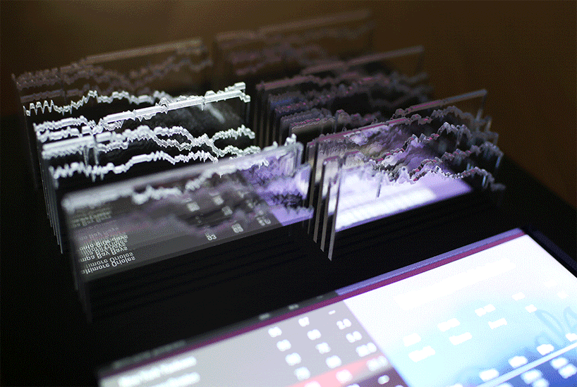
using game-day data from the major league baseball in the USA, toronto-based design studio teehan+lax labs have developed a memento that captures all the drama, struggles, and highlights from the 2012 MLB season. conceived as part data visualization experiment, part non-electronic digital product, and part tablet accessory, the interactive unit combines dynamic and physical information to create an engaging visual experience. using an iPad, ‘season in review’ helps tell the story of the different 162 games and 30 teams in a baseball season.

the interactive sport statistics uses game-day data from the major league baseball
the digital intervention presents organized data and statistics; the information tracking measurement directly communicates how well a team is playing related to other teams in their division, thus providing valuable contextual patterns like slumps, winning streaks, and divisional see-saw battles over first place. using laser-cut acrylic and aircraft plywood for its construction, the interactive tablet attachment showcases graphs that include the performances from the red sox late-season collapse, oakland’s unlikely ascent, and the less-than-stellar season by the astros.
‘season in review’
video courtesy teehan+lax labs

the memento captures all the drama, struggles, and highlights from the 2012 MLB season

‘season in review’ is part data visualization experiment, part non-electronic digital product, and part tablet accessory

the interactive unit combines dynamic and physical information to create an engaging visual experience

using an iPad, the concept helps tell the story of the different 162 games and 30 teams in a baseball season

the digital intervention presents organized data and statistics

laser-cut acrylic detail

the attachment provides an interactive statistic viewing experience