main entrance
just like a brand new trip, we investigate and look for new realities, new uses, new sensations. the restyling concept for the place where we book this trip aims to transmit to the travelers a different vision from the usual travel agency polychromy and clutter, hardly forcing on shapes, colors and contents simplicity. a simple environment, where lines twist, merge and overlap without creating loss and confusion sensation, describing an intuitive and rational operative space where each operator or visitor has his own clear position, never generating chaos, derangement and noise. two translucent-frames separated settings are linked together to create an unique environment trough simple shapes replicating and rationally disposing: a travel agency preparing the travelers through formal, chromatic and lighting coldness, to live unforgettable emotions and sensations.
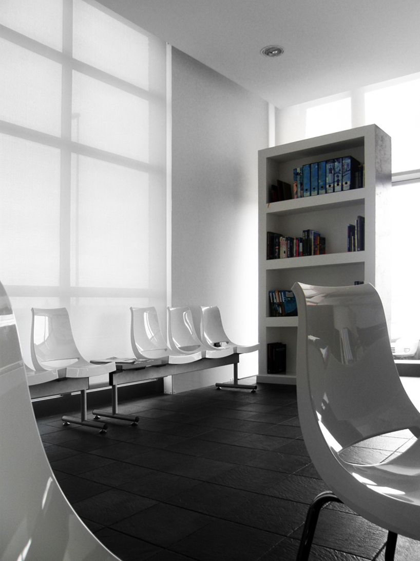
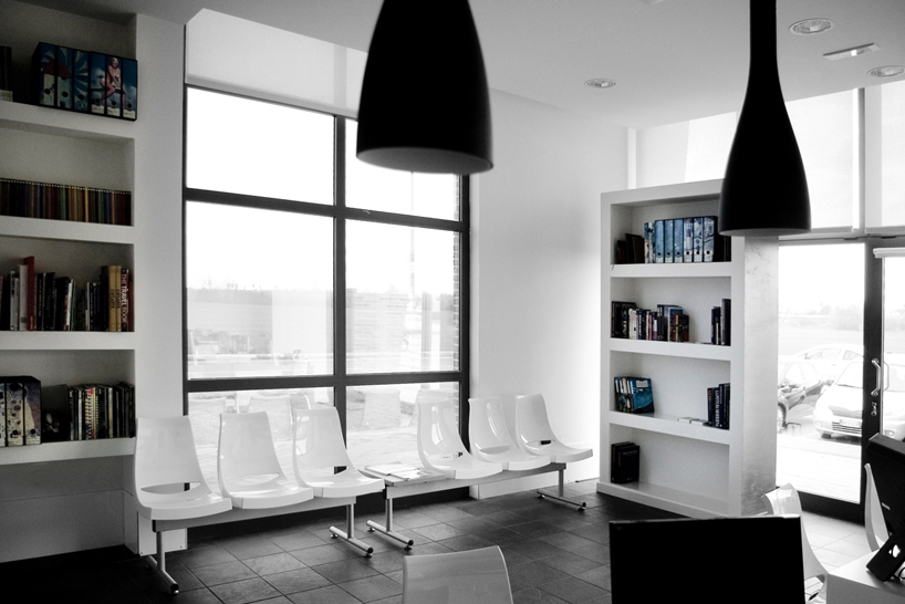 customers area
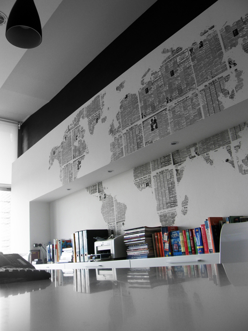
 tour operator area
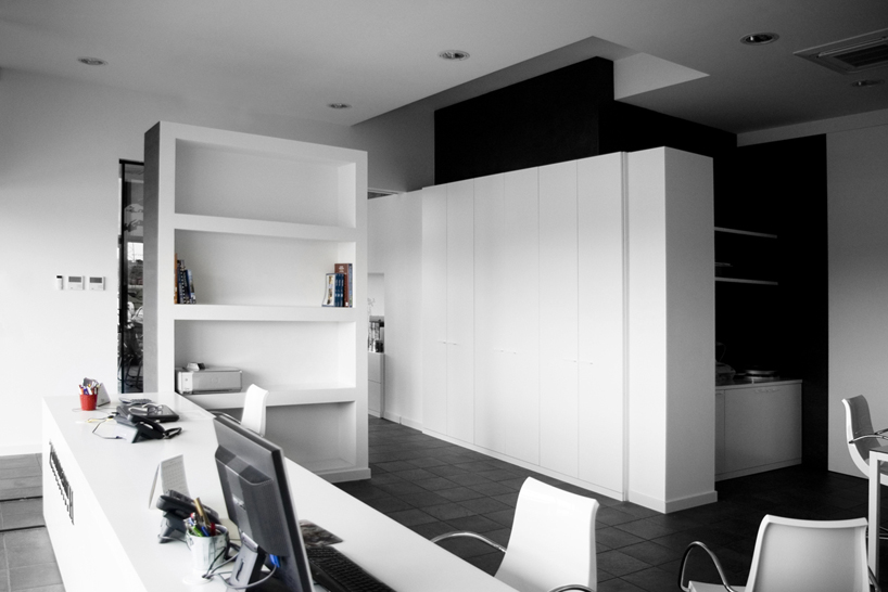 operative corner
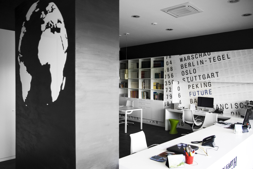
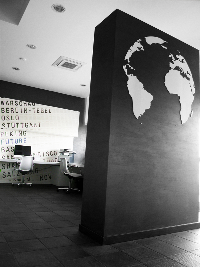 zoominearth logowall
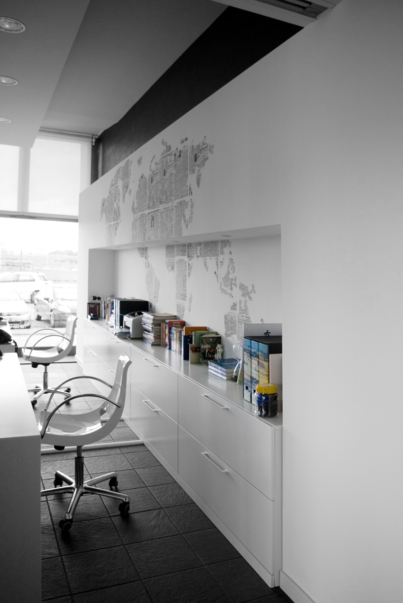
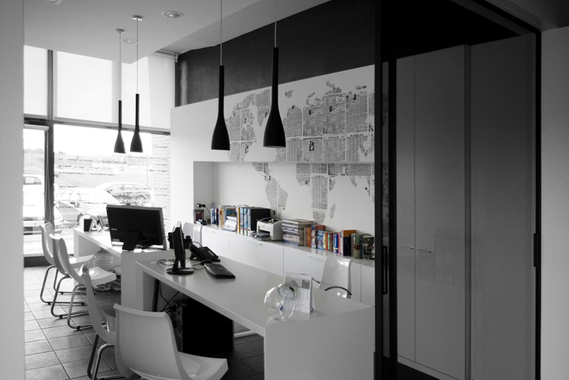 travel agency area
 incoming services area
 customers area
 operator desk
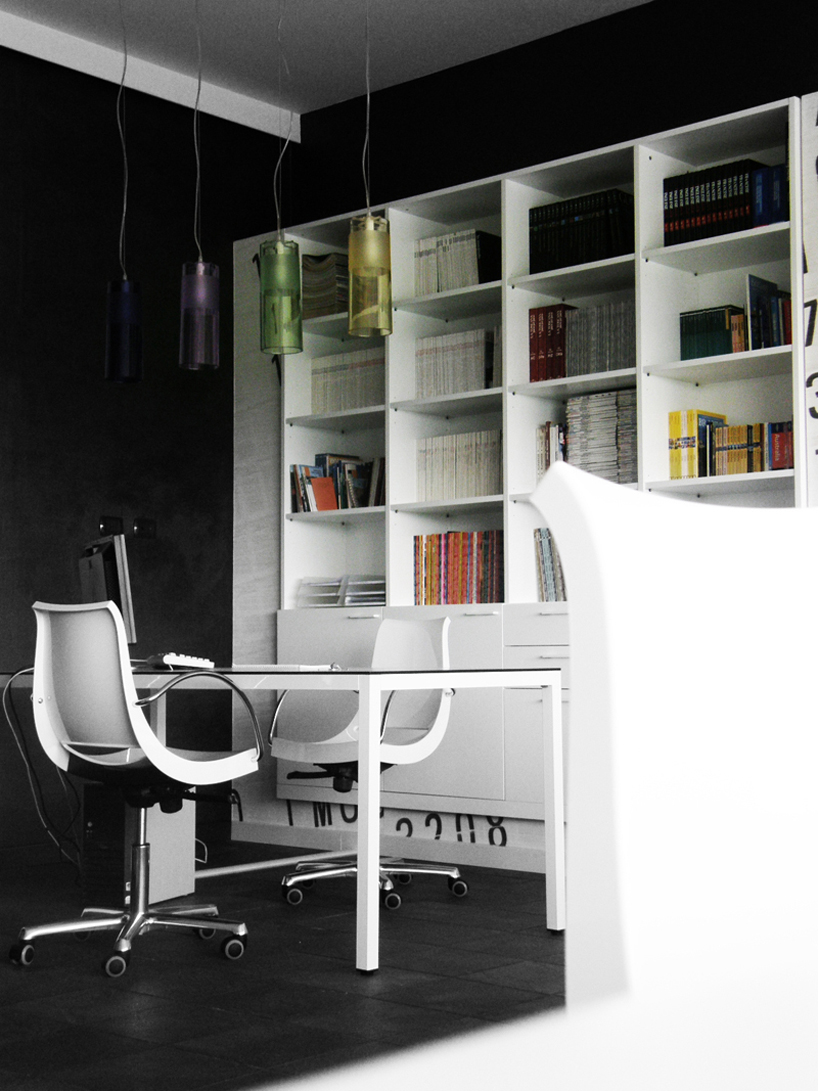
 on-demand furniture
 seating detail
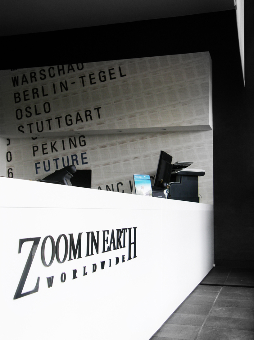 zoominearth logo
project info:
concept and design: 2011 completion: 2012 approx surface: 100mq client: dalcanto [travel agency] + zoominearth [tour operator] + entroterra [incoming services] photographic credits: marco stacchini, michele simonetti [msX2] http://www.msx2.it
designboom has received this project from our ‘DIY submissions’ feature, where we welcome our readers to submit their own work for publication. see more project submissions from our readers here