KEEP UP WITH OUR DAILY AND WEEKLY NEWSLETTERS
as visitors reenter the frick in new york on april 17th, they may not notice selldorf architects' sensitive restoration, but they’ll feel it.
uncover the colorful legacy of italy's iconic train, designed by gio ponti and giulio minoletti in the '50s.
connections: 98
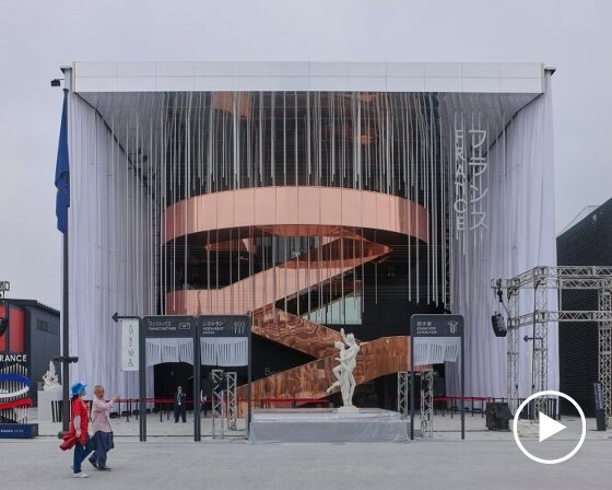
from hungary’s haystack-like theater to portugal’s ethereal wave of ropes, discover the pavilions bridging heritage, sustainability, and innovation at expo 2025 osaka.
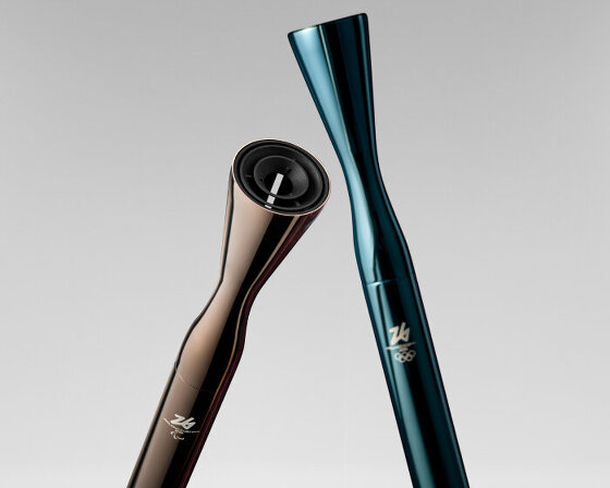
unveiled as well at the italian pavilion in expo 2025 osaka, the design uses fuel coming from cooking oils and animal fats.
connections: +180

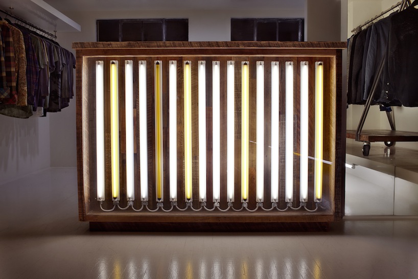 reclaimed-wood cash wrap, the store focal point
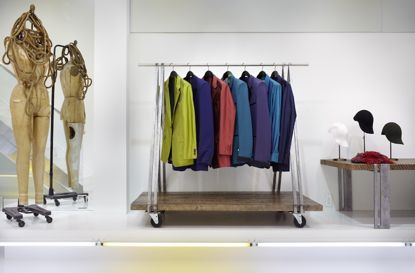 the racks and tables rise up above fluorescent lights
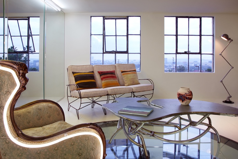 the client lounge is lifted above the store
 a leaf chair is suspended
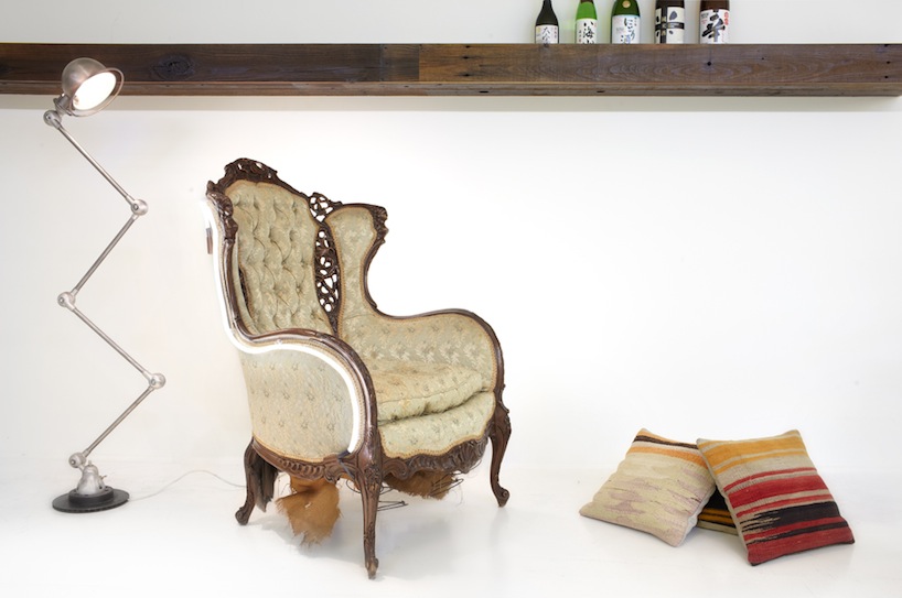 another shot of the neon wrapped chair, influenced by lee broom