KEEP UP WITH OUR DAILY AND WEEKLY NEWSLETTERS
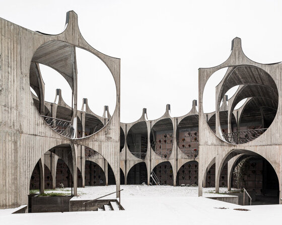
the two photographers documented over 100 structures from the 1960s-80s, from cemeteries and sanctuaries to port buildings and residential complexes.
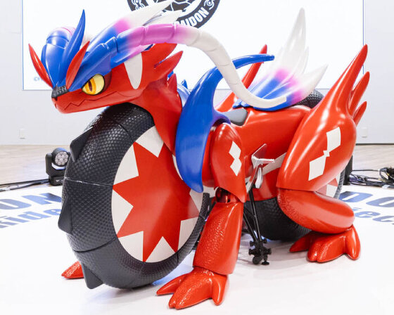
a real-life model of the two-wheeler appears at honda welcome plaza aoyama in tokyo, japan in march 2025.
connections: +550
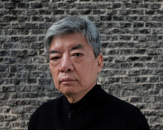
the founder of jiakun architects, is recognized for his humanistic approach, crafting spaces that combine the everyday with the utopian.
connections: 39
see how architects and designers transformed neglected buildings into stunning, sustainable spaces through Fiverr and designboom’s global competition!
connections: 2
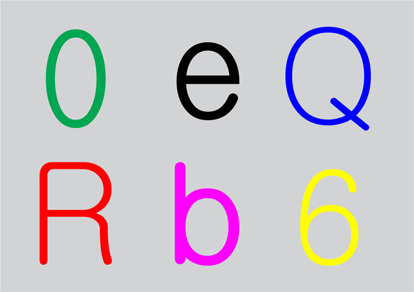
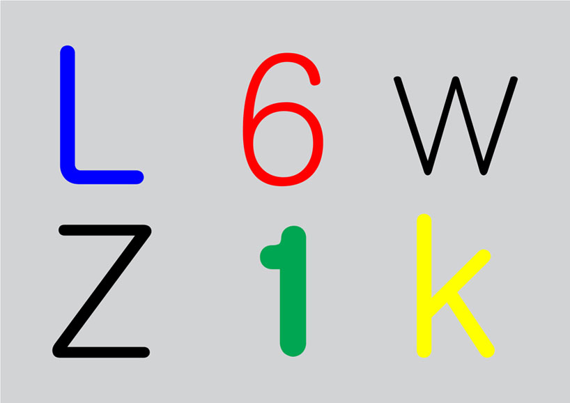 set of letters from the "equal"
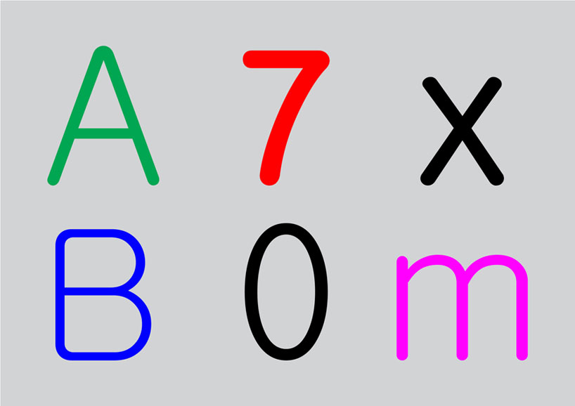 set of letters from the "equal"
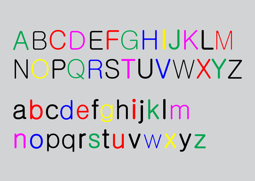 the "equal" typeface