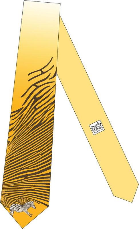
z+brah! by yuko okuma from usa
designer's own words:
We don't see world as simple anymore. Things have multiple side and multiple meanings. We are used to multi-task. We as consumer have reached saturation point and one sided design no longer satisfy.
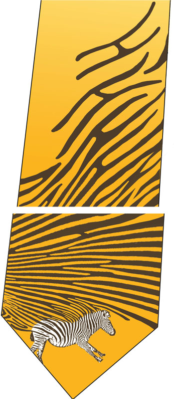
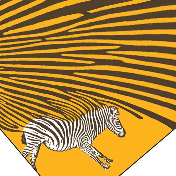
The tie pattern transforms one element to another, from a zebra to zebra pattern to the letter H. Background is complimented by color of Hermes logo in gradation. This pattern design provides two different looks from distance and close up as well as visual flow from top to down or down to top as if solving puzzle.
General view
 Close up view
 Detail of pattern
shortlisted entries (268)