xiclopes by francisco lopes from portugal
designer's own words:
my proposal has as principal objectives be simple, direct, modern, and that keep related to the image of moleskine, such as the logo of moleskine this continue following its simplicity, its aspect more modern due to the fact of the medium in which is inserted: a blog, so the aspect more modern for it could adapt to the medium in question. the grafic form that complements the m and the k serves so that this logo don't completely turns off of the moleskine universe.
logo proposal
 logo proposal in black background
 logo monochrome
 alternate logos
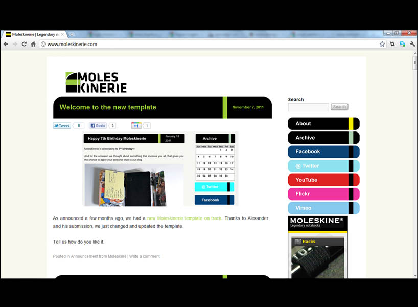
 application of logo
shortlisted entries (2162)