wysiwyg by susan strampel from netherlands
designer's own words:
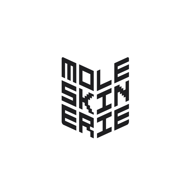
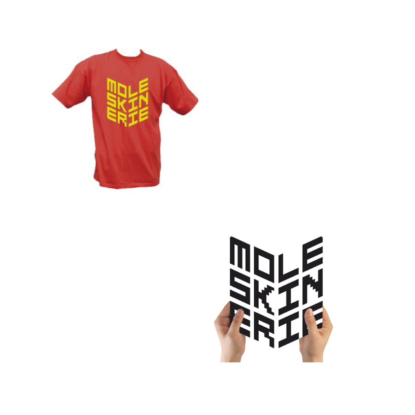
the logo is simply a registration of what the moleskinerie site has to offer. the font i created looks to digital which refers to 'computer'. the text is shaped in a book, which has a double meaning: it refers to an open book which is what people literally share on the blogsite: pages of their art or text created in their moleskine book and it figuratively refers to sharing personal things, the expression being 'an open book'.
moleskinerie wysiwyg logo
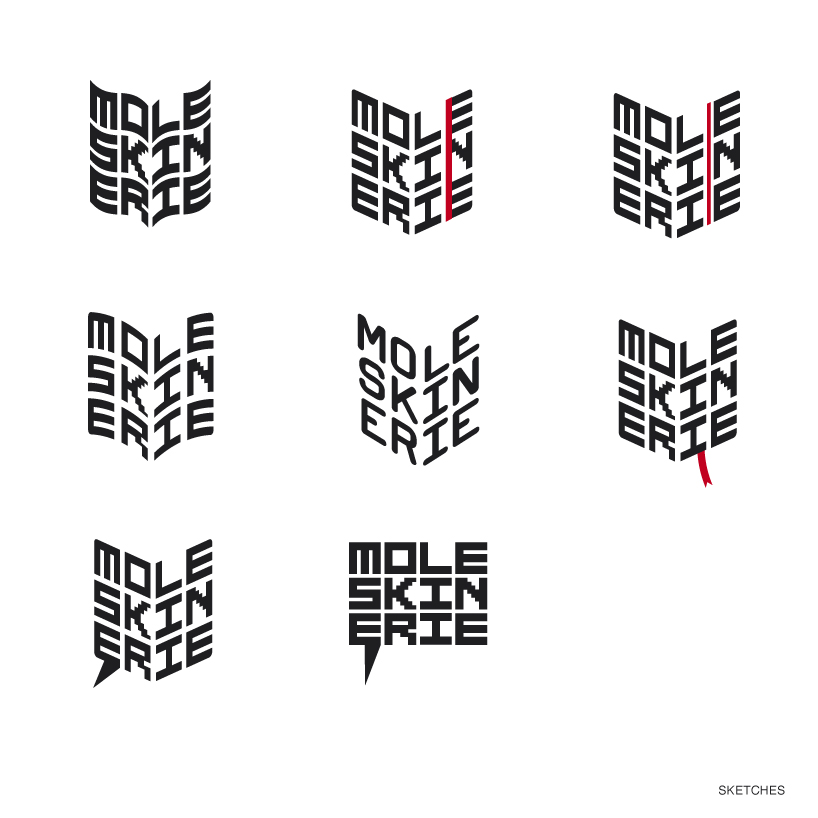 moleskinerie wysiwyg logo sketches
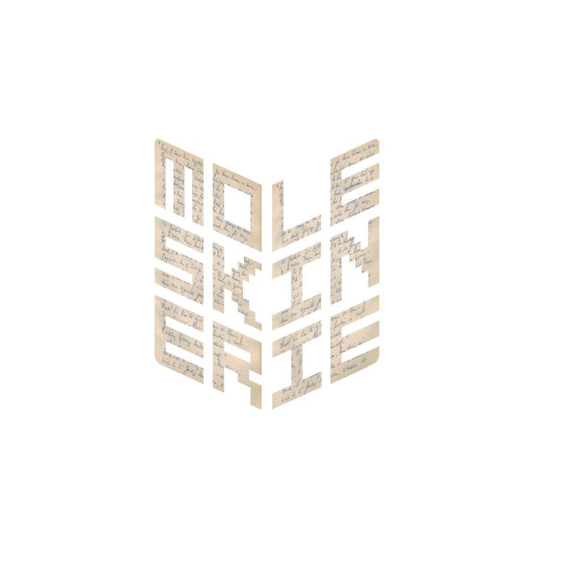 moleskinerie wysiwyg logo application 1
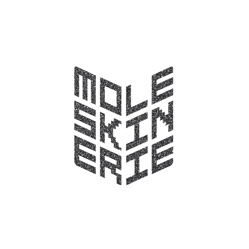 moleskinerie wysiwyg logo application 2
 moleskinerie wysiwyg logo application 3
shortlisted entries (2162)