world of moleskine by novica milenkovic from serbia
designer's own words:
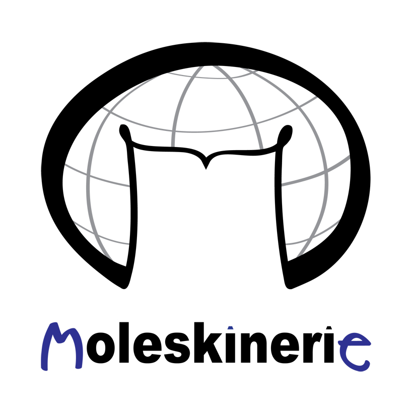
the symbol: globe and the notebook. the symbol should say moleskine is an international product, it is for traveling, nomadic life, for anywhere on the globe. there are no geometrical shapes in the symbol everything is handwritten and organic, thus indicating something warm, familiar, personal… also outline of the notebook associates of letter "m" for moleskine.
moleskinerie typography: two letters are standing out: "m" and "e". these legendary notebooks are for me, from beginning to the end, my personal resort, whether i’m an artist, student, businessman or i just like to draw, doodle, scribble, write down important stuff, organize my time and work or organize my travels. and who wrote those letters "me"? well it was "i" (letters "i" are pens, inspired by design of moleskine pens). also color of the letters is blue, because it should associate to the color of ink, thus something handwritten and again personal.
logo with typography
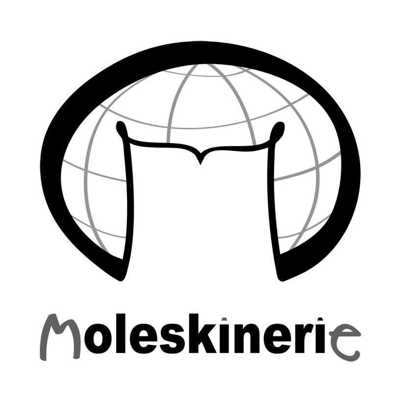 grayscale
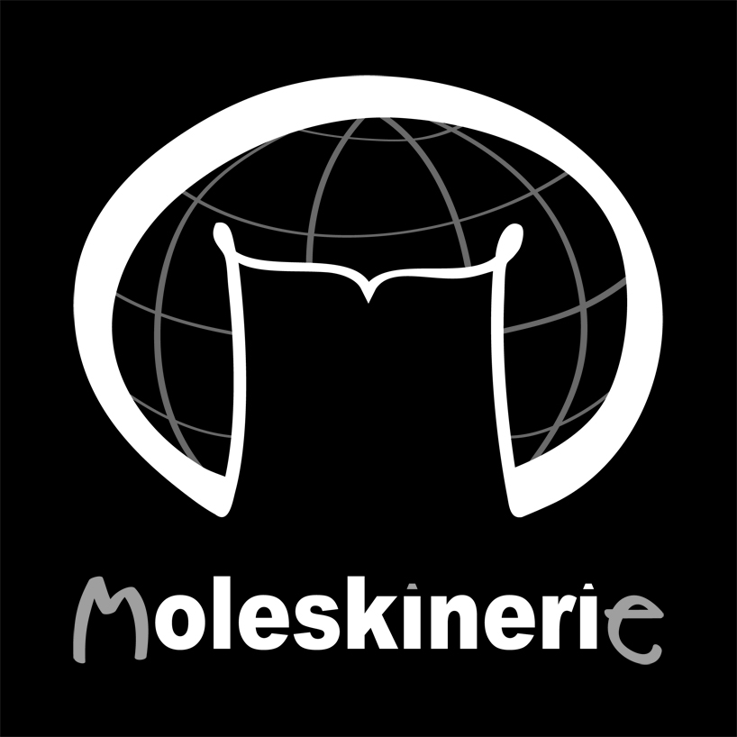 invert
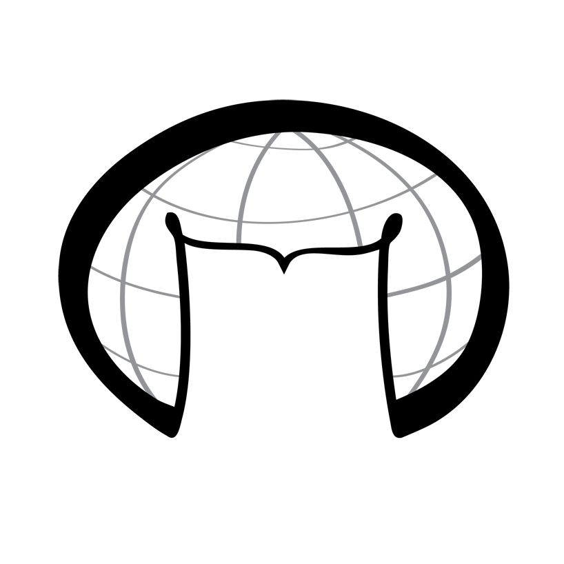 just logo
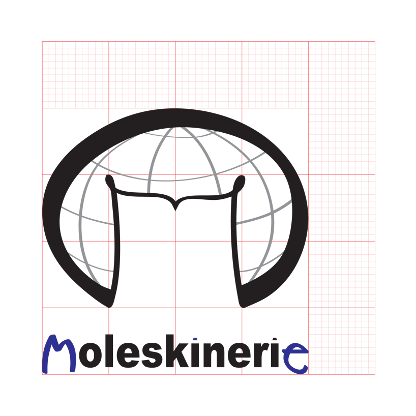 logo and typography on grid