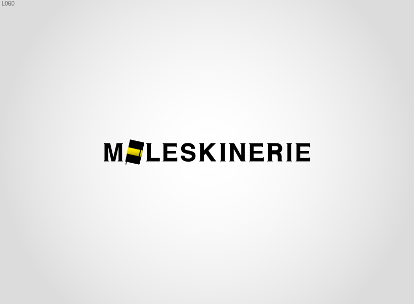
Where is the O? by giovanni pregnolato from italy
designer's own words:
For this logo I decided to maintain the unique and essential corporate identity of Moleskine. Integrating the "image" of the 'notebook in the logo, diversify and adds a little color to the final result.
The logo is made with vector graphics, so versatile and usable on any format and support you want.
With this work I wanted to represent class, elegance and creativity. Enjoy.
Logo
 Dimensions
 on black
 black&white
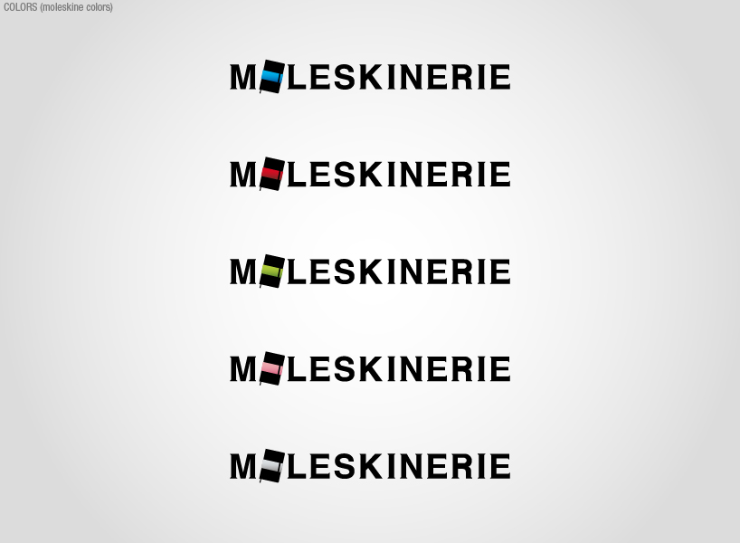 colors
shortlisted entries (2162)