Welcome to the Moleskinerie. by richir pascaline from france
designer's own words:
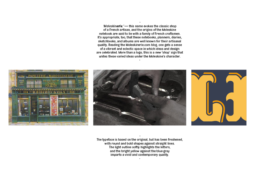
‘moleskinerie.’ — this name evokes the classic shop of a french artisan, and the origins of the moleskine notebook are said to lie with a family of french craftsmen. It’s appropriate, too, that these notebooks, planners, diaries, sketchbooks, and albums are well known for their artisanal quality. reading the moleskinerie.com blog, one gets a sense of a vibrant and eclectic space in which ideas and design are celebrated. more than a logo, this is a new ‘shop’ sign that unites these varied ideas under the moleskine’s character.
the typeface is based on the original, but has been freshened, with round and bold shapes against straight lines. the light outline softly highlights the letters, and the bright yellow against the blue-gray imparts a vivid and contemporary quality.
Moleskinerie Logo
 Concept board