vittoria poletti: by vittoria poletti from italy
designer's own words:
The aim of the competition was to create a brand new logo for MOLESKINERIE.com, the official blog of Moleskine.
Combining the nomadic essence of Moleskine with the digital world features means to update its look with something completely different and find a new way to communicate to young people.
I think of Moleskinerie as a powerful virtual identity, an appealing world made of dynamic people coming from all over the world that can keep in touch and share their experience through this blog.
It's not like a social network, but rather similar to a community of people who have the same interests: art, writing, poetry, drawing and photography, people who already use Moleskine products in their everyday life.
I've tried to sum up these concepts in a very simple and direct logo suitable for a website and smart to be easily recognizable everywhere.
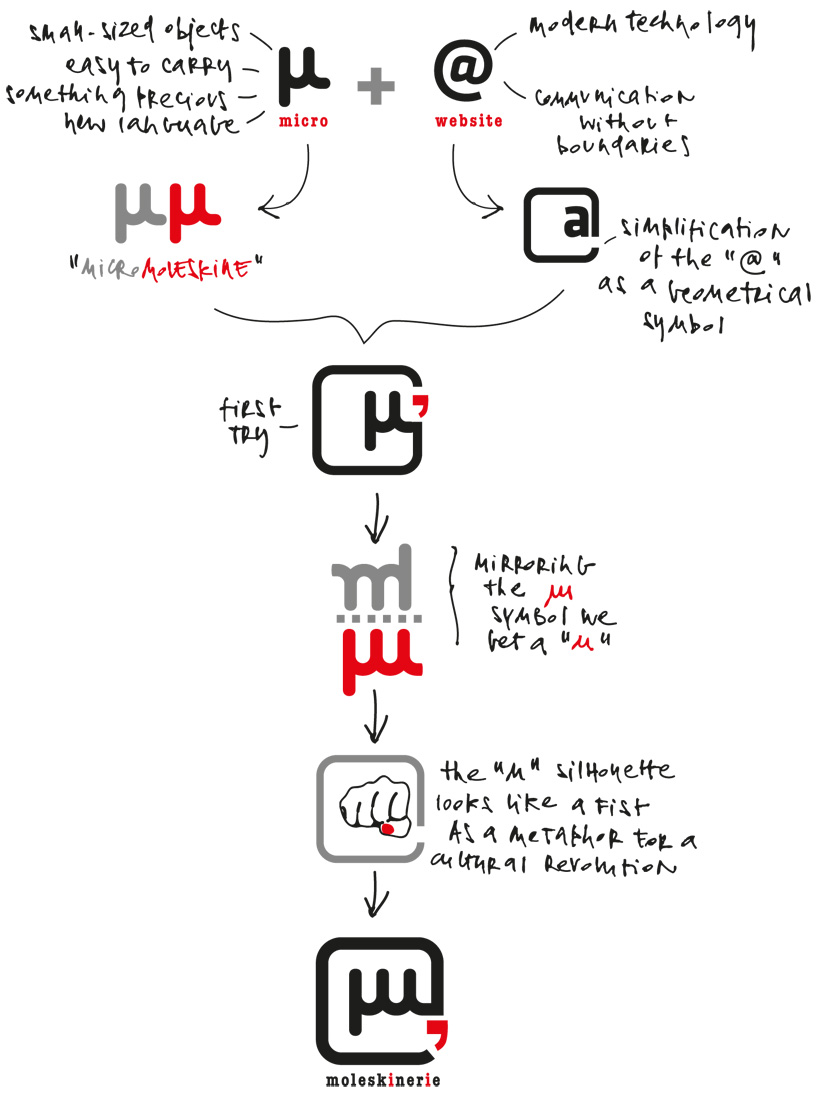
Looking for a short name for the "moleskinerie" word I found some suggestions in the world of Maths: the concept of micro (µ) summarizes the idea of a basic unit of measure: "micro" becomes the unit of measure for modern creativity as important as moleskine is as a means of communication for its target.
Creativity should be "micro" in the sense of being like a gift, something immaterial but brilliant that makes a difference, a "x-factor" that changes and simplifies everyday life.
"Micro" as something quick to understand, easy to notice, precious to remember as a good advice.
Everyone who owns a moleskine is quite a creative person, so "micro" turns out to be like a symbol, a trademark that stands for the moleskine community itself.
Moreover the logo looks like fist-shaped as a metaphor for a big change, a sort of peaceful cultural revolution.
This underlines that who owns a moleskine is different from other people: he wants to "fight" for his right of creative expression, he wants to be noticed and make his own way.
The design must read "moleskinerie" so I've added some text playing with the red color (apostrophe) even if the logo as a graphic symbol could stand by itself.
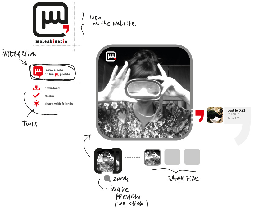
Since the logo should work mainly on the web - and on pictures as well - i've tested it by creating a design for a webpage.
concept
 black and white
 web template
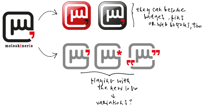
 playing with the new logo
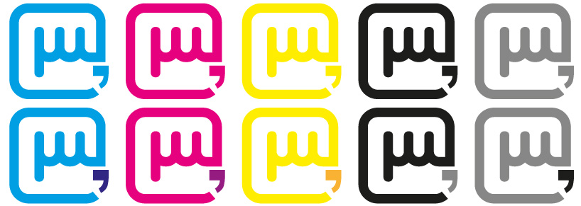
 color test