vittoria poletti: by vittoria poletti from italy
designer's own words:
The aim of the competition was to create a brand new logo for MOLESKINERIE.com, the official blog of Moleskine.
Combining the nomadic essence of Moleskine with the digital world features means to update its look with something completely different and find a new way to communicate to young people.
I think of Moleskinerie as a powerful virtual identity, an appealing world made of dynamic people coming from all over the world that can keep in touch and share their experience through this blog.
It's not like a social network, but rather similar to a community of people who have the same interests: art, writing, poetry, drawing and photography, people who already use Moleskine products in their everyday life.
I've tried to sum up these concepts in a very simple and direct logo suitable for a website and smart to be easily recognizable everywhere.
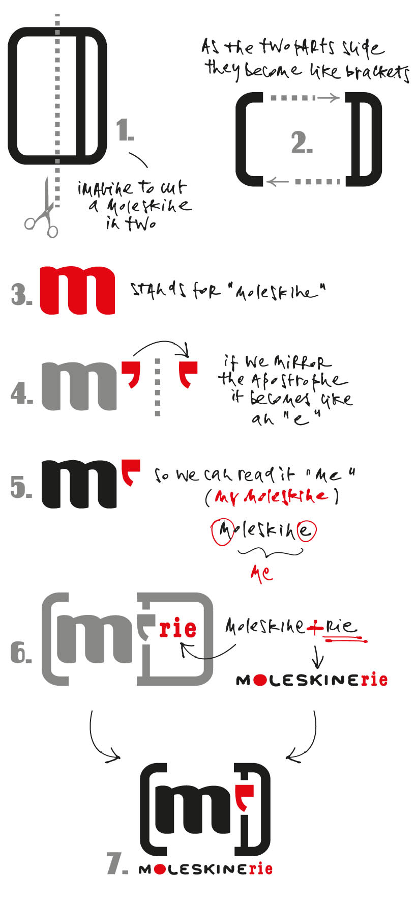
The logo respects the identity of Moleskine: the shape (like a sketchbook), the black rubber band, which is like a label of the brand, the "m" letter standing for Moleskine itself and a red small apostrophe sign that mirrored becomes a "e".
Concept steps:
1. imagine to cut a moleskine in two
2. as the two parts slide they become like brackets
3. "m" stands for moleskine
4. if we mirror the apostrophe it becomes like an "e"
5. so we can read it "me" (my moleskine)
6. moleskine+rie in the additional text to read "moleskinerie" below the logo
Moleskinerie becomes "me", like a web shortcut to get the password to the secret world of Moleskinerie.
"Me", like a mathemathical exponent, a way to say my extra-space, a virtual custom-made dimension where everyone can be himself.
"Me", like my moleskine.
The design must read "moleskinerie" so I've added some text playing with the red color (apostrophe) even if the logo as a graphic symbol could stand by itself.
Since the logo should work mainly on the web - and on pictures as well - i've tested it by creating a design for a webpage.
In the color test I've decided to take as a source of inspiration part of a Moleskine advertising.
I've made a redesign by replacing each "color pixel" with my logo from one side, while the color pixel are mirrored on the other.
The two halves together display a sort of "M", like an accidental tribute to Moleskine.
Concept steps: 1. cut a moleskine in two 2. as the two parts slide they become like brackets 3.
 black and white
 web template
 color test based on the old advertising
 detail
 color test