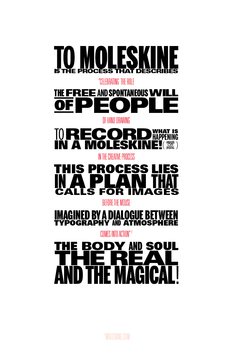
TO MOLESKINE by Metroquadrado® Metroquadrado® from portugal
designer's own words:
all we had was the history of the brand, the word "moleskinerie" and the intention of the brand to embrace new media and new ways of drawing, at a time where there is the awareness that digital media will supplant the analog means.
however, the visual imaginary of moleskine®, is what gives it a visual identity and it is extremely physical. more than the logo typeface, notebooks and the field of action where it lays draws the known identity.
our answer to the project began with a question.:
"how to pass the physicality of the brand into a digital environment such as a blog?"
with an intuitive, spontaneous, physical, passionate, impulsive, unexpected, individual, collective, unique, genuine, intense, dynamic, graphic, powerful, free, curious, emotional and… personal, approach.
the project should be seen as a continuous process that results in a shared and collaborative process, which requires an approach of all who intervene, always questioning its effectiveness, its power, the timeline of its meaning and results. It should be suggested by the definition of what it isn´t, not as a subtraction, but as an addition, as a sculptor that reveals an image trough the act of removing pieces of stone from a block, reaching its final "construction".
To Moleskine
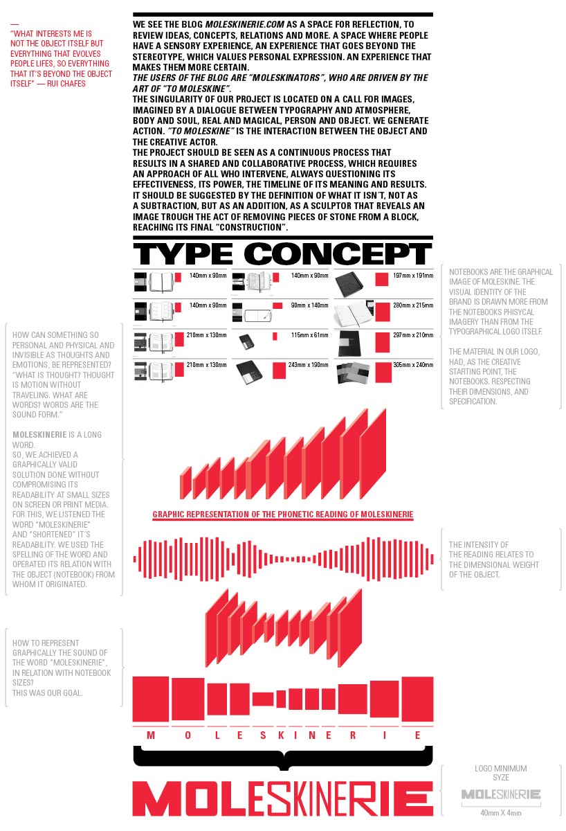 Type Concept
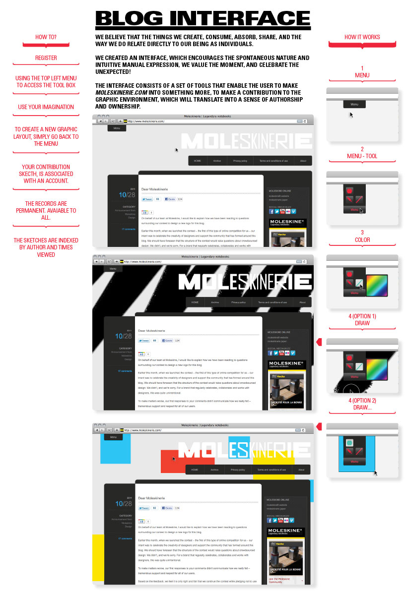 Blog Interface
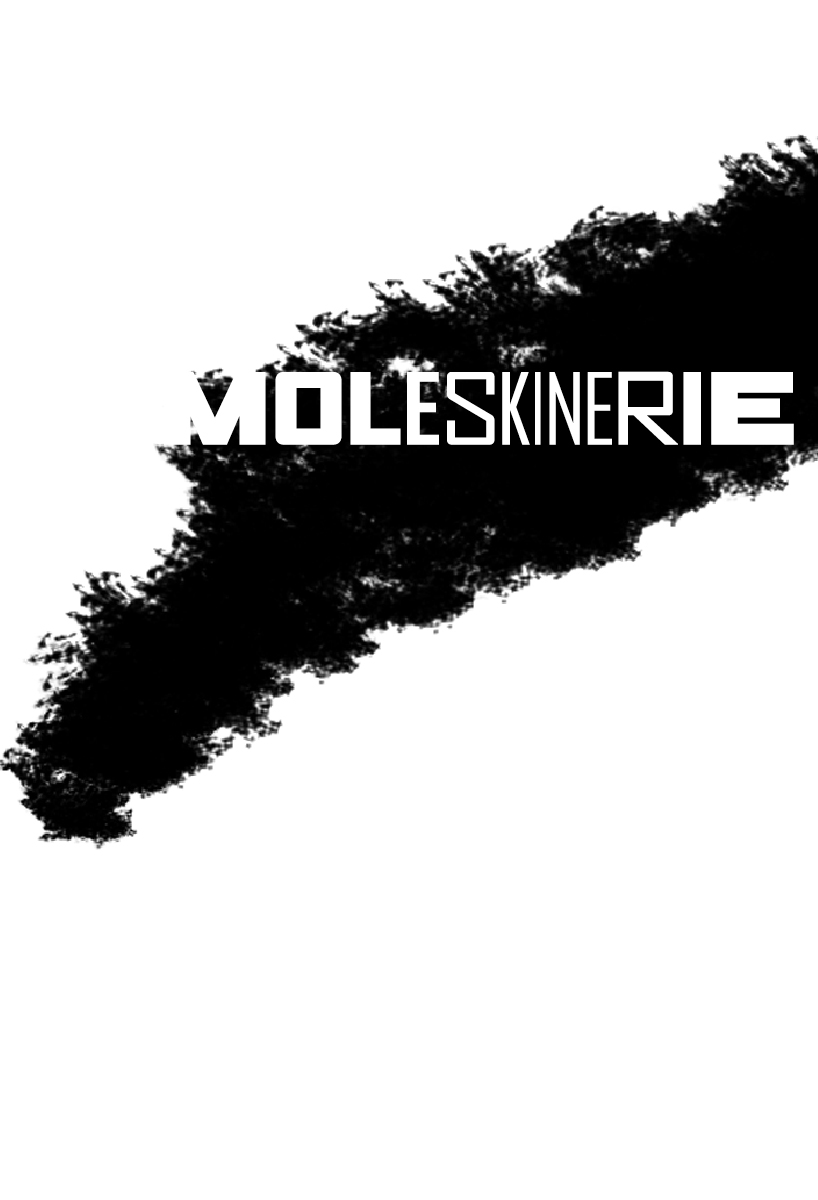 Poster Expression
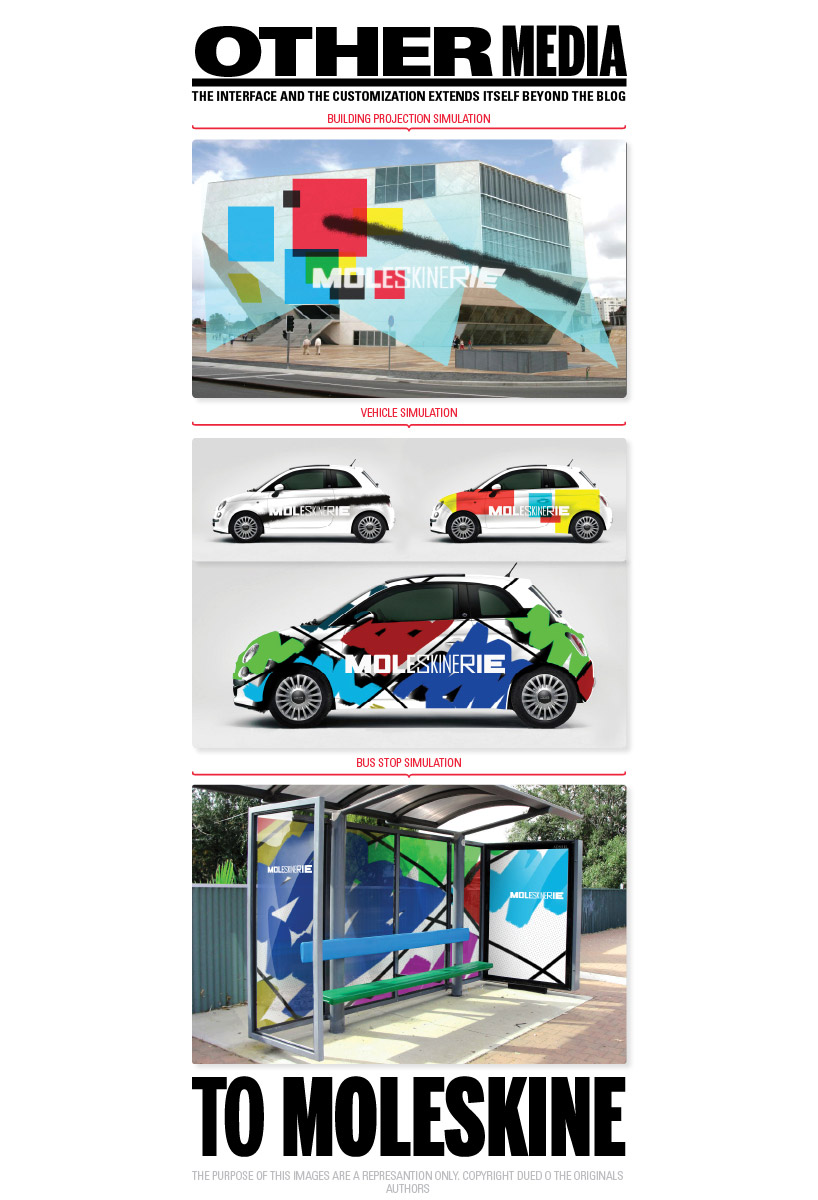 Other Media
“To Moleskine”, the movie