three projects for Moleskinerie logo by neda vassileva from bulgaria
designer's own words:
Because of the adventurers, and traveling all over the world people, that are buying and using the Molskine products, I decided to make one of the three visions of this “MOLESKINERIE” word!
Three projects was made in Corel draw software and are in curves.
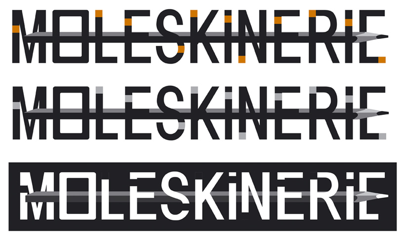
The first logo project is like reminding the lights of the airports, or street lights of the city, imagined all these people using their diaries, folders and accessories. Very ordinary letters, just with their “light buttons” and with one O, which is like the back of the pencils and pens of Moleskine. Because I like the shape of these, also put one of them as a base on the back.
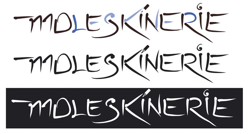
The second image is inspired from the artists and their free hand drawings and open minds. Just like when you talk on the phone and scatch some expressions, words, projects or forms. Free and ethereal lines with a bit muted colors.
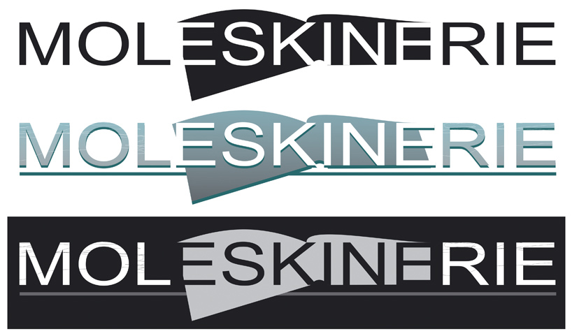
The third logo project is like more strict, usual and straight with colder shades and also with some scratches for to be a bit like used.
Moleskinerie_project_1
 Moleskinerie_project_2
 Moleskinerie_project_3