threading the logo by Hamish Mclachlan from new zealand
designer's own words:
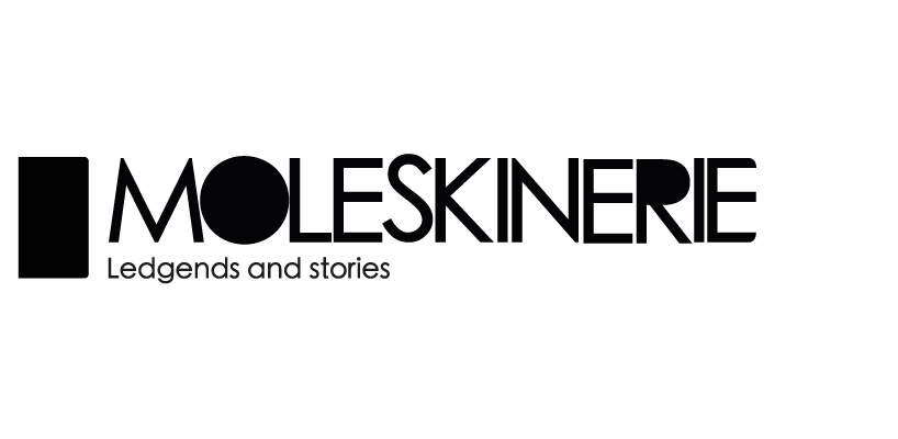
a moleskine object is made to become a part of your personality, a medium for your expression, a platform for your creativity. simple tools, which are well designed, beautifully made, they are ready to be incorporated into your everyday life and also for more extraordinary uses. when designing a masthead for moleskinerie three factors influenced the design. simplicity, formality and adaptability.
the logo incorporates a simplistic approach. as a spine of a book holds together the pages of a moleskine, the masthead holds the pages together of a website. using this mentality the final form references a weaved piece of string in the form of text. complimented with the logo of a black rectangle with two rounded corners, a silhouette of the product.
the moleskinerie website masthead aims to take a step back to allow posted stories and images be the main focus of given web pages. the logo gives breathing room to whatever is displayed much like moleskine book; the user gains creativity by the use of a conservative formal logo.
Due to the simple nature of the logo, it is able to be adapted into any blank sheet and be inverted for black backgrounds.
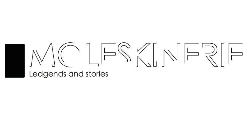
concept
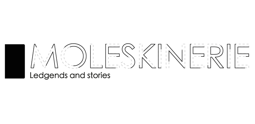 development
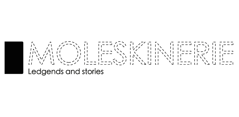
 development
 final
final
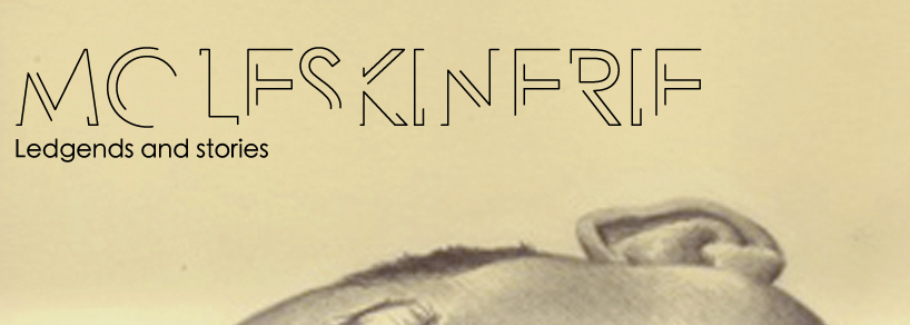 in context; moleskine
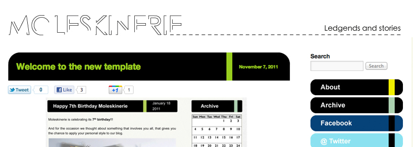 in context; moleskinerie