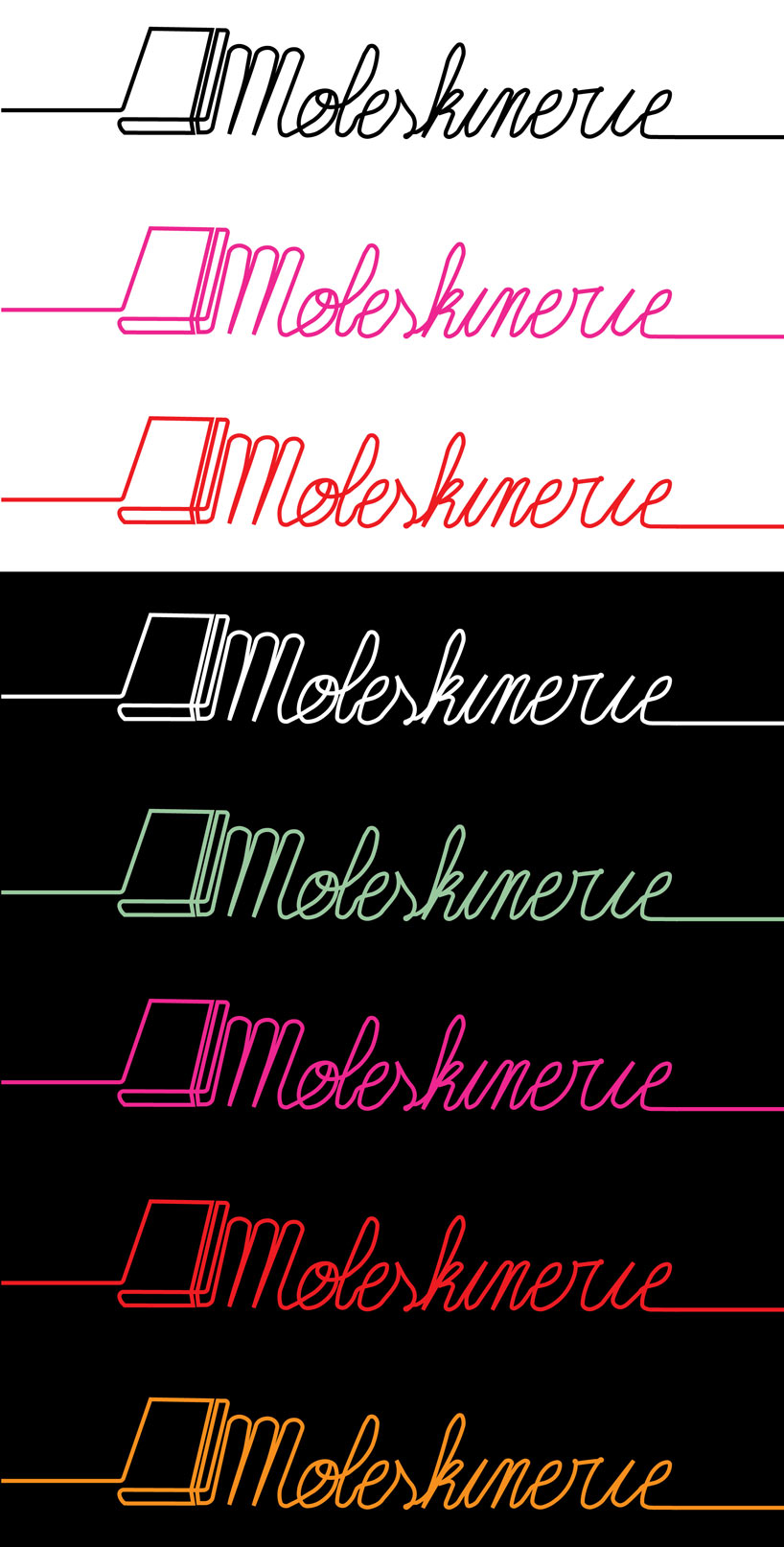
the traveling line by manuel becerra from france
designer's own words:
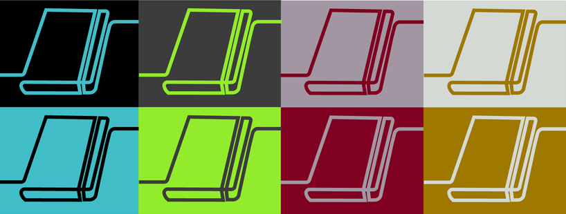
simple, clear and recognizable, the logo is made of the two main uses of the moleskine notebooks: sketch and handwriting. the continuous traveling line symbolize the moleskine travel spirit. monochrome; it can be adapted to any color or background.
the logo is made of a single line that continues further, retaking the nomadic spirit of moleskine.
 made of sketch and handwriting, the logo is the mirror of the moleskine spirit and history.
 the logo captures the simple and recognizable identity of the nameless black notebook
 the logo works in a single colour, that can be reversed
 the logo can work with any background colour
 web
web
shortlisted entries (2162)