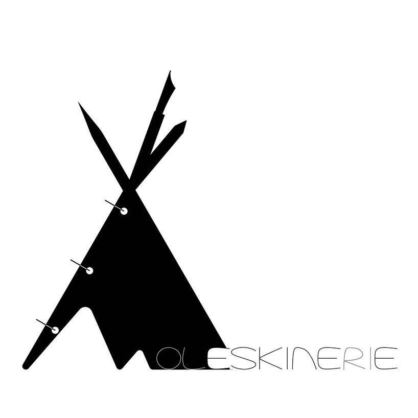
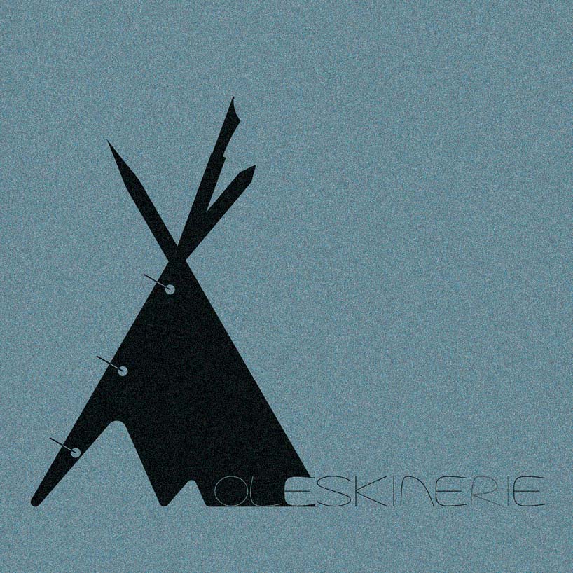
the TIPI for the NOMADIC by parthasarathi chakrabarti from india
designer's own words:
• The logo is an abstraction of the most recognizable nomadic tent – the Tipi – using writing symbols associated with MOLESKINERIE – the clip folder, pens and a pencil.
• The font is a derivation of hand written all-caps – associated with writing on notebooks.
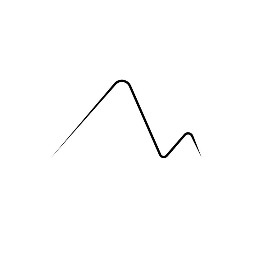
• The entry to the tent abstracts into the ‘M’ of MOLESKINERIE – This ‘M’ itself can expanded into branding and used as a symbol in very specific instances to identify a MOLESKINERIE product.
• The logo is scalable to any size and has immediate recognition value and can be composed in any colour, background, contrasts and be etched or embossed on any material without losing any of its value.
• After a few hand drawn sketches for ideations, the logo has been entirely created in AutoCAD through a process of multiple iterations and evolution of the shapes and text styles to lead to the perfect composition.
logo-black-main
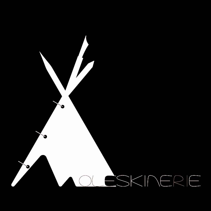 logo-white
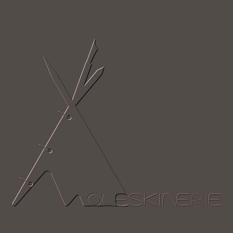 logo-embossed
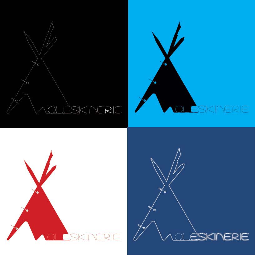 logo-options
 logo-etched
 logo-M