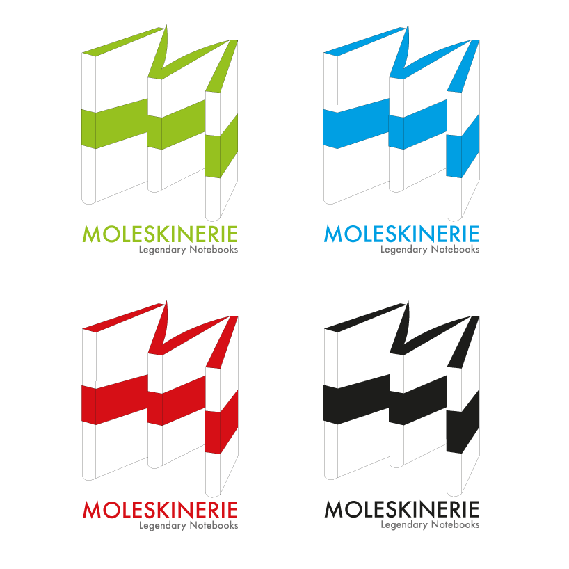
the three notebooks by thanhvan huynh from belgium
designer's own words:
this logo is a simple and straightforward design inspired on the layout of the moleskinerie notebooks. by playing with the angle of the books, it's possible to create the image of a m-shape, which I find is a subtle hint without moving too far away from the notebook concept.
moleskinerie
 moleskinerie_blue
 moleskinerie_red
 moleskinerie_black
 moleskinerie_green
shortlisted entries (2162)