the professor by aditi bisen from india
designer's own words:
as the logo is for a blog, it should represent a form of dialogue. the proposed concept therefore turns the moleskine notebook into a talking character. this simple illustration should appeal to molskineries' bloggers due to its graphic, animated look.
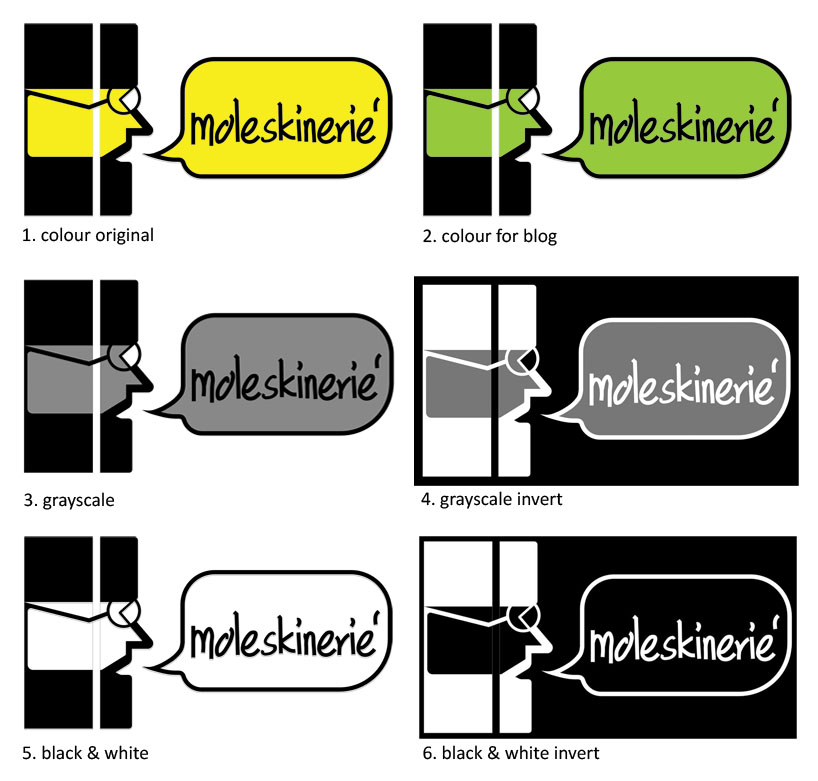
the text is custom created by rastering personal handwriting to represent a designer's scribbling. the colours used are yellow from moleskine notebooks and green to match the new look of the blog. the logo is legible on all scales and would look good in monochrome, grayscale, and multiple colours. it would also be easy to duplicate and print.
the professor
 various tones
 on web page
shortlisted entries (2162)