
the open notebook by nina carrillo from belgium
designer's own words:
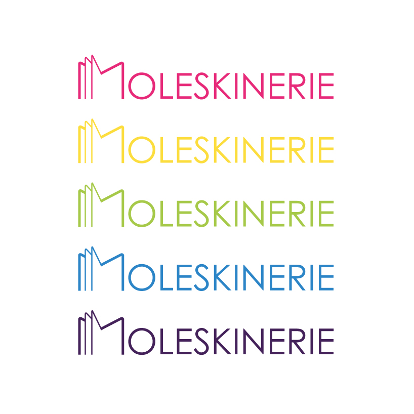
this moleskinerie logo focuses on moleskine notebooks identity. rounded corners maybe are the most relevant characteristic that connects with their formal aspect.
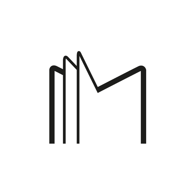
the « m » of moleskinerie represented an open moleskine notebook and it is shaped with these rounded corners. it can also be used, independently of the rest of the word, as a logotype in its own.
the rest of moleskinerie word is written in a sans serif font (century gothic) that contrasted with the original moleskine font, an academic bold serif font reflecting above all the history of the brand.
shortlisted entries (2162)