the notebook by marek józefczuk from poland
designer's own words:
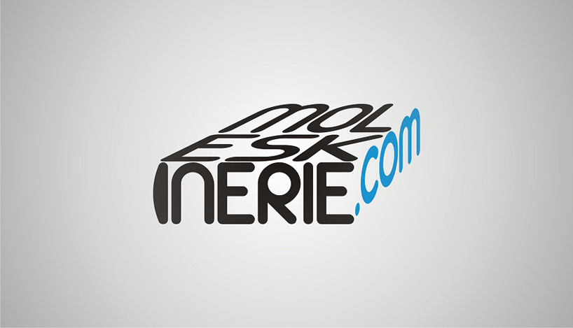
this logo reminds us a look of lying notebook. to achieve this effect i used "perspective" tool and additionally curved letter "i" so that it looks like notebooks back. my "notebook" is fully made from name "moleskinerie.com". in this project i also used the same retro looking font that i used in red icon project.


shortlisted entries (2162)