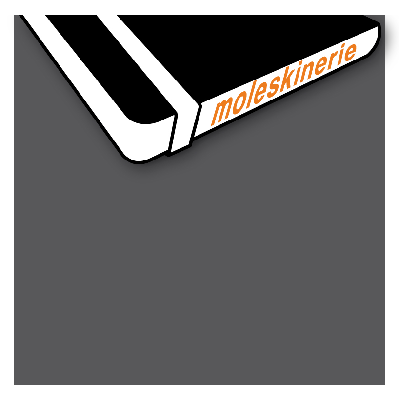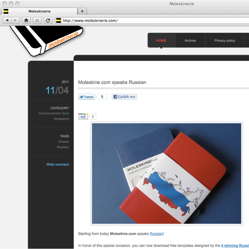
the new moleskinerie logo one by johannes hagendorfer from austria
designer's own words:
as a starting image, the standard form of a moleskine book is applied.
the recognizable shape and rubber band remains as a distinguishing feature of the moleskine book.
i chose a flat perspective and a simple black / white colour combination to emphasise these features.
finally the text "moleskinerie" appears in orange letters on the side of the book.
design01_01
 design01_02
shortlisted entries (2162)