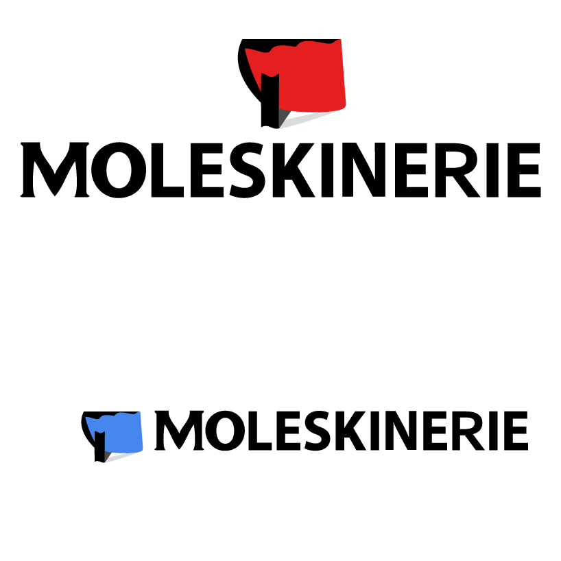
The new Moleskinerie ldentity by Sas Etteh from uk
designer's own words:
I am quite familiar with the Moleskinerie brand haven used their notepads as a child. For this task, i did some brainstorming and decided to settle on a logo that beard some resemblance to a Moleskine notepad. I was inspired by the ridges of a closed notepad with a book marker sticking out. Font is modified with special emphasis on the 'M'. Logo is all vector so scalability will not be an issue.
Logo concept
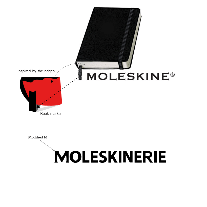 Design philosophy
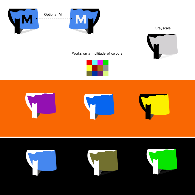 Flexibility
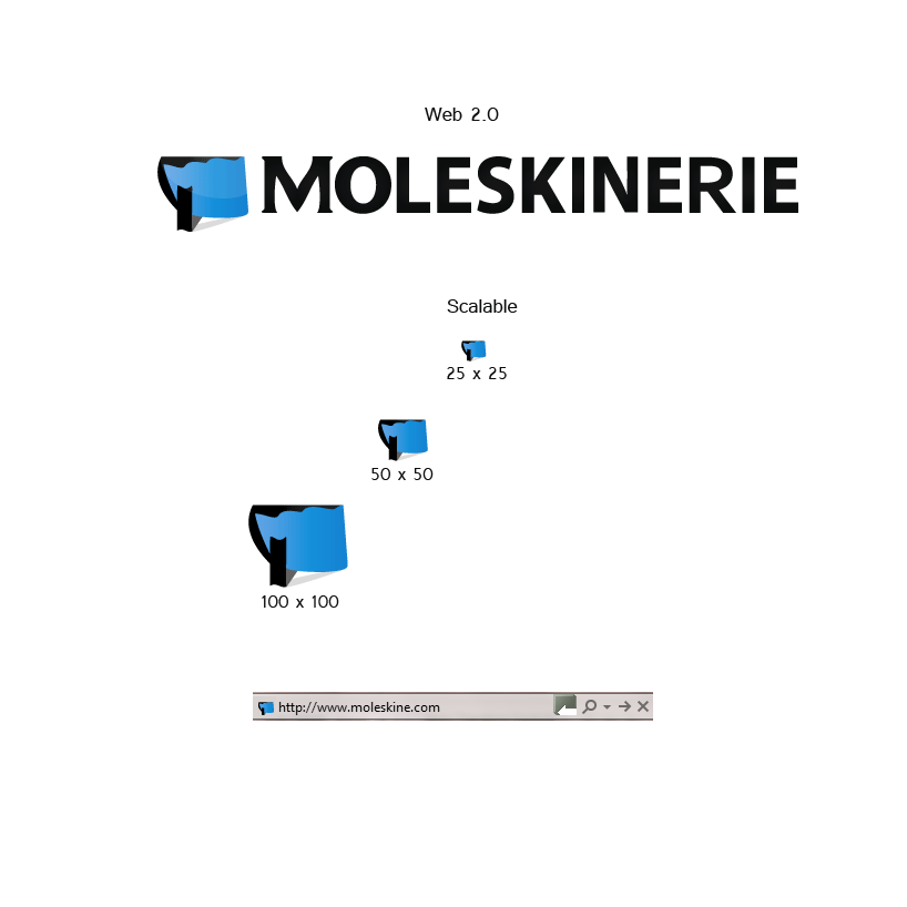 The Web
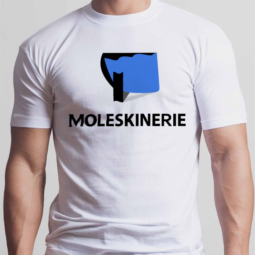 T-shirt example
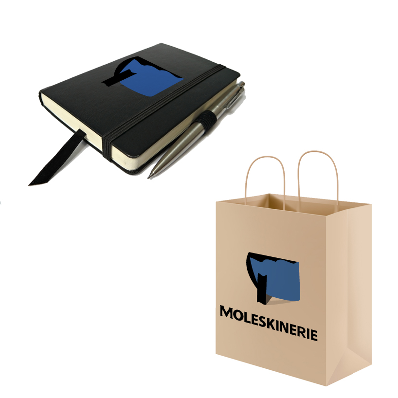 Merchandising example
shortlisted entries (2162)