The M logo by Corrado Coduri from italy
designer's own words:
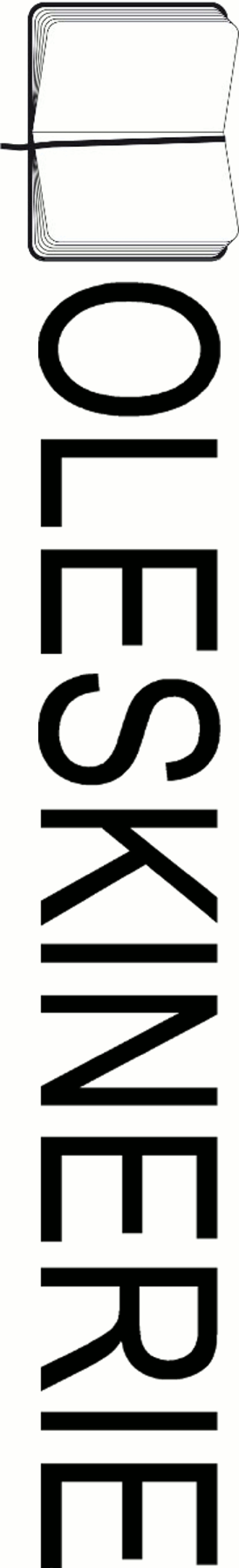
the initial design analysis was focused on the meaning of the brand and the blog.
my intention was to find an idea, a symbol that could connect in a single image these two words (these two worlds) and fortunately there is an object, a symbol of moleskine, that perfectly suits to the meaning of the blog too.
moleskine is a diary, a real and physical notepad and the blog is a diary, a virtual and digital notepad.
the logo was born from this strong idea and starting from here building the image was easy: an opened diary using the m of moleskine and moleskinerie like a basis of a representative image.
The concept image
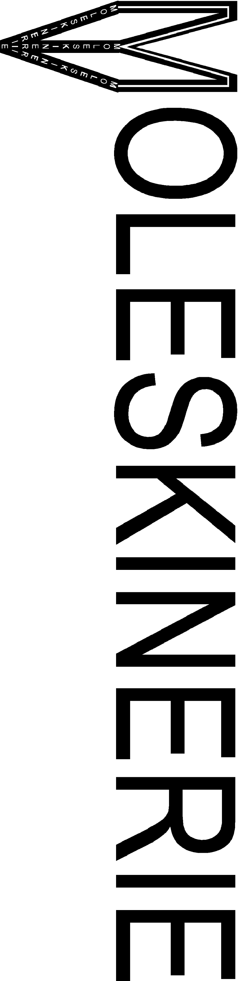 The logo into the written
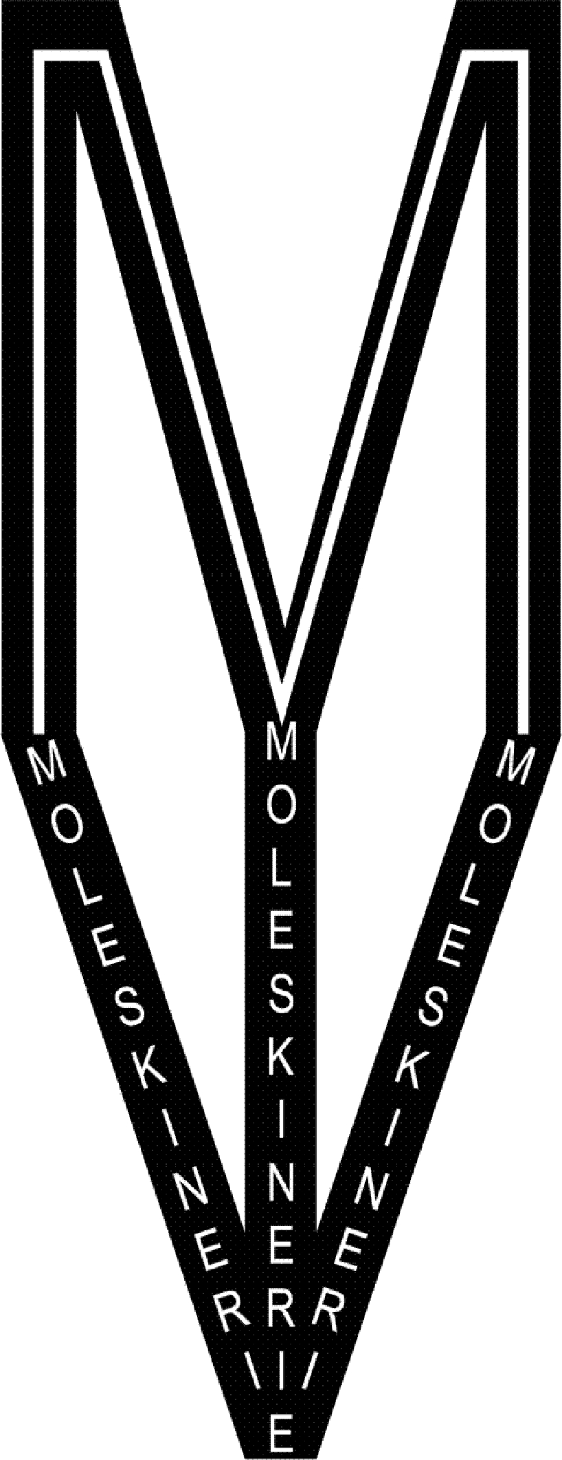 The M logo
shortlisted entries (2162)