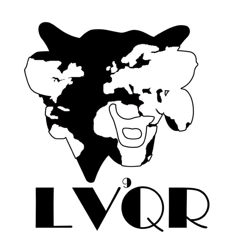
The Laughing Cow's 90th anniversary competition applicant (Melanie) Design: 2 by melanie yip from china
designer's own words:
at the beginning, i have already wanted to incorporate the idea of "global" inside my design. it is because lvqr has remained to be a global brand for many years and its cheese products are well known to most of the population in the world. however,as i progress, i did not quite like my initial product as i thought inputting an entire world map inside the cow icon looked a bit odd. i was stuck and played around with the image. Then, I realize the color match of black and white looked much more neater and it suggested a vintage feeling across the design, which matched with the long history of lvqr. then i further mortify by removing all the strokes in the image but this one i am submitting here is including strokes, so it shows the "laughing cow" element more obviously.
LVQR Black/White Phantom