the brand and the gesture by arbex luiz from brazil
designer's own words:
only three letters distinguish the name of the blog "moleskinerie" of the brand name
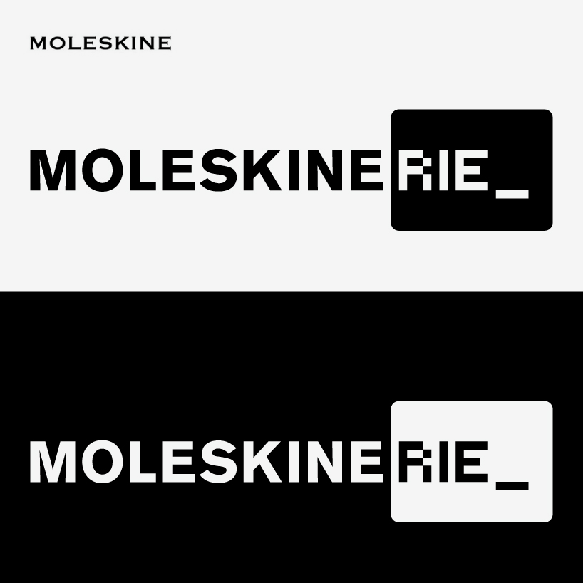
"moleskine". to emphasize this element of differentiation, logotype presented combines the features of the brand to the peculiarities and possibilities of the digital space. thus, the main term suggests original logo “moleskine” through the use of letters in uppercase in the typeface "akzidenz-grotesk" denoting precision, austerity and elegance, characteristics of the “moleskine” brand. since the suffix "eRIE" (whose meaning is "place" as in rotisserie, brasserie, lunetterie) suggests brand presence in the digital environment. the suffix uses a bitmap typeface
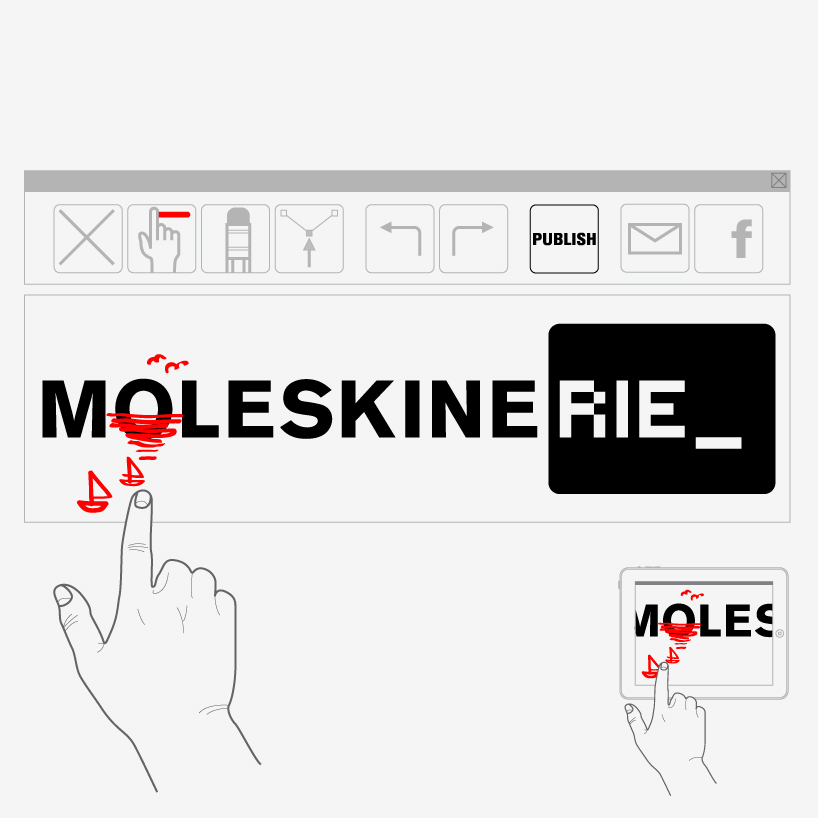
on a black rectangle that refers to digital screens. on the other hand, the “moleskine” products are intended for use in the physical environment. they are objects for handwriting. how to suggest such a gesture in the digital space? it is proposed that the blog presents a simple interface for drawing that allows users play with the letter "o" of the logotype and post their interventions. thus, it is possible to suggest the spontaneity of gesture and handwriting of the products of the brand moleskine even in the digital environment
logotype: positive version and negative version
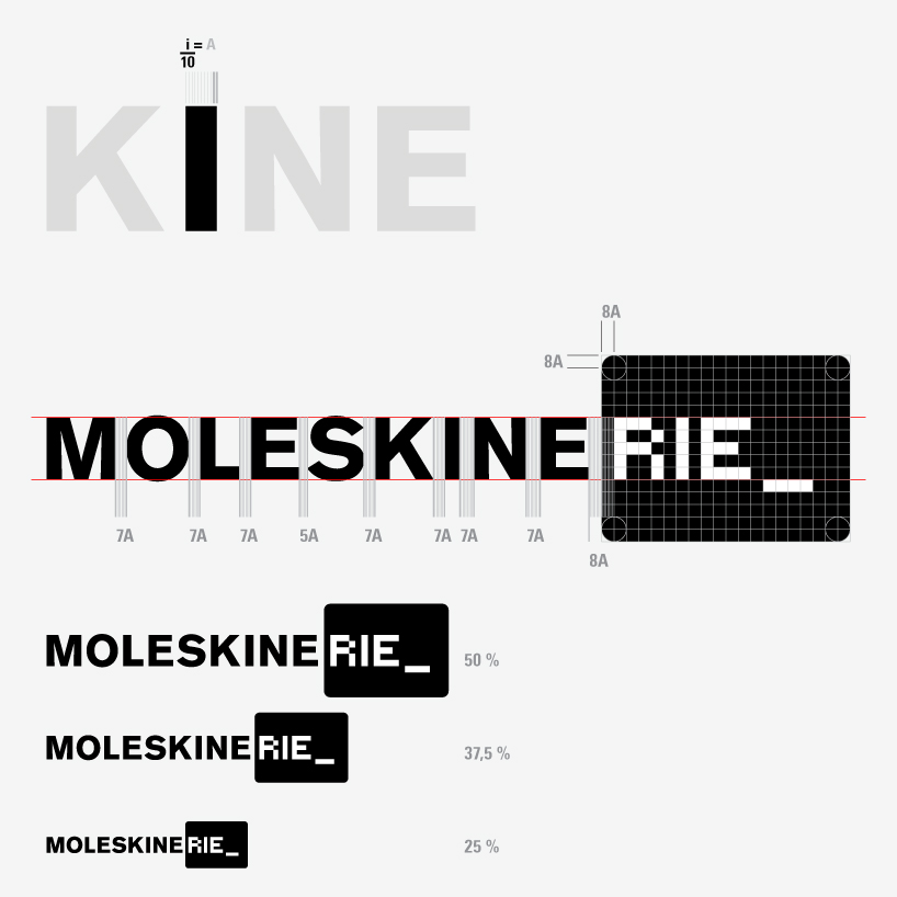
 a) constructive aspects: diagram shows that the module of kerning is obtained by dividing the width of the stem of the letter
 interface of drawing that allows manual interventions on the logotype. These interventions take place within certain restrictions. They are: the limits of the area that contains the design and the color red as the only available.
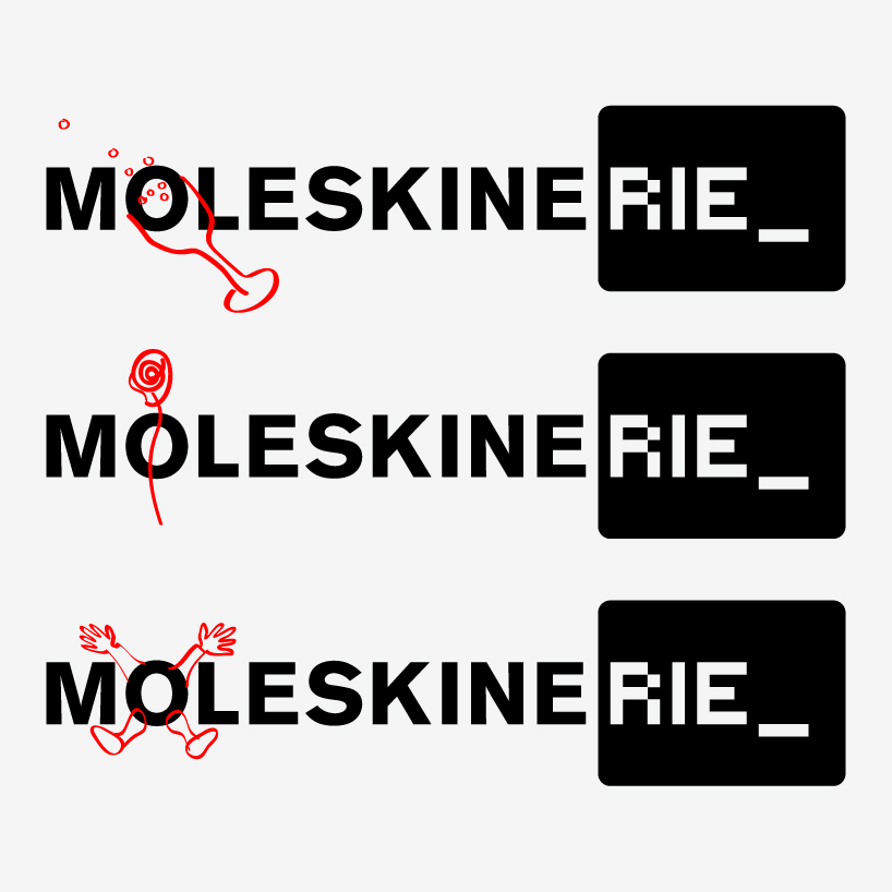
 some possible drawings: by means of constraints is possible to achieve an identity between them
aspects of interaction with the logo in the digital environment