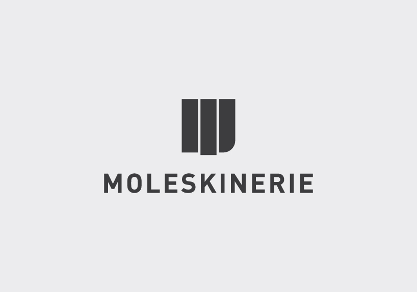
The better M by willem willemklerk from netherlands
designer's own words:
MOLESKINERIE
The better M
Symbolism:
The meaning behind this symbol in short. The lower right corner of a Moleskine© together with the elastic closure forms a 'M'
Style:
The style is very minimal, clean and bold because of the reputation Moleskine©. They are known for their minimal notebooks.
The boldness of the logo is related to the bold attitude a Moleskine© book has
Typography:
I've chosen the DINpro Bold as the ultimate typeface for Moleskinerie. It is a Sans-Serif font, but i thought that this font came closest to the 'M' symbol.
Colors:
In colors, i also kept it simple. The main color i have chosen is 90% of Pantone Process Black. Because it's almost printable on every background color.
But sometimes it is better to do it in a diapostive way. That why i included some different colors.
With kind regards,
Willem Klerk
The main logo
 on a darker background
 on a light blue background
 on a dark purple background
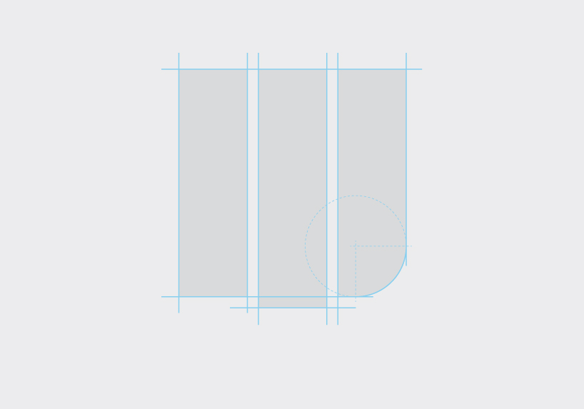 the making of
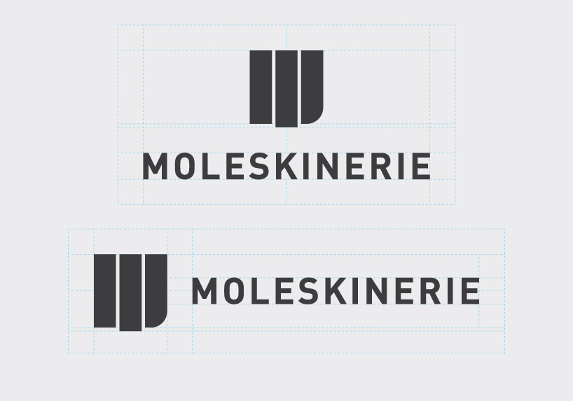 different positions of the M-symbol