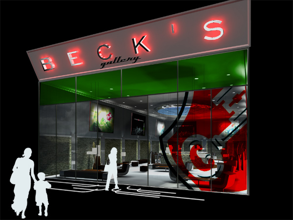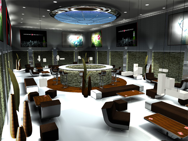
the bart by sébastien poupeau from france
designer's own words:
I wanted to associate Beck's to contemporary art by creating a bar which is a gallery and vice versa. Art asks questions as Beck's wants us to make a choice between live or exist. Artists are invited to express themselves in that place through differents means : paintings, photographs, videos, ... This is a place of freedom where anyone is invited. The aim, linking Beck's to contemporary art, is to offer a general idea of a universe to people which is not especially informed about it. This shows also the interest of the brand Beck's to the world which moves about it.
From the outside, a luminous sign call the passers-by. It works like a mark in the night. The entry way is totally transparent to let you see people and the works of art inside the place. The logo oversized on the windows shows the entrance in the world of the brand. Inside, a large luminous object, like a futuristic sculpture, overhangs a circular bar and changes colors and beat to the sound of the music diffused during the night. The counter is in the center of the place, a meeting point. You can also sit on one of the pieces of furniture. Their generous proportions invite you to share your space with one another. Regarding the materials, I wanted to create a contrast between the ' warm ' ones like wood , leather and stone and the ' cold ' ones like aluminium, mirrors and white resin ( for the floor). This contrast is also effective for matt and glossy. This reflects the warmth of a bar associated with the harshness of a gallery. Both live together as Beck's tells us to do. It is simple. This is the key.
entry way
 interior
 furniture