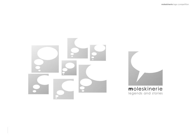
text field by tamas morocz from hungary
designer's own words:
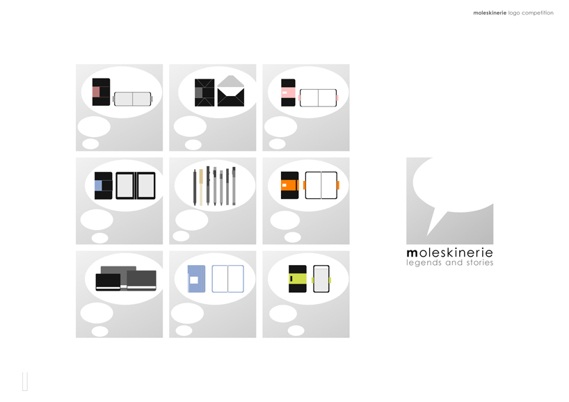
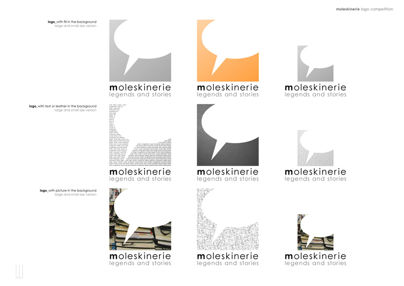
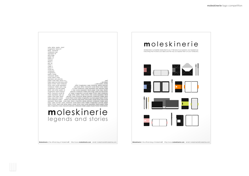
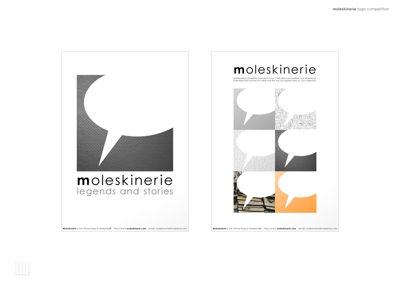
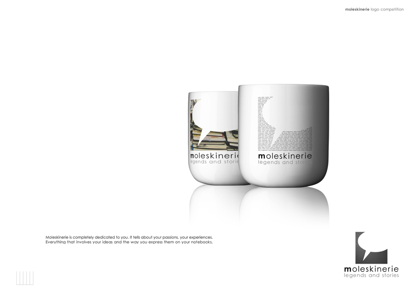
the concept of the design is based on a simple idea. moleskinerie is an official blog; it tells about experiences, passions and adventures. so i used an empty text field as a logo. it is empty, and the background can be a fill, or a picture, or some texture (maybe words or sketch-lines) also. everyone can tell so about his ideas and his passion.
moleskinerie_1
 moleskinerie_2
 moleskinerie_3
 moleskinerie_4
 moleskinerie_5
 moleskinerie_6
shortlisted entries (2162)