squared layout by sammy bikoulis from uk
designer's own words:
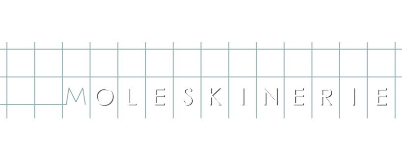
a typical squared layout page is the environment for my moleskinerie logo. the 'm' emerges from the lines of the page and the rest of the letters are represented as a cut-out of the page. the lines together with the 'm' are the foreground of the logo doubling as a monogram as shown on the thumbnail.
logo design
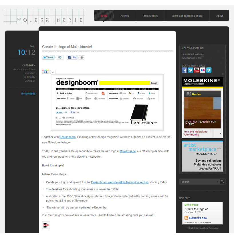
 application on blog
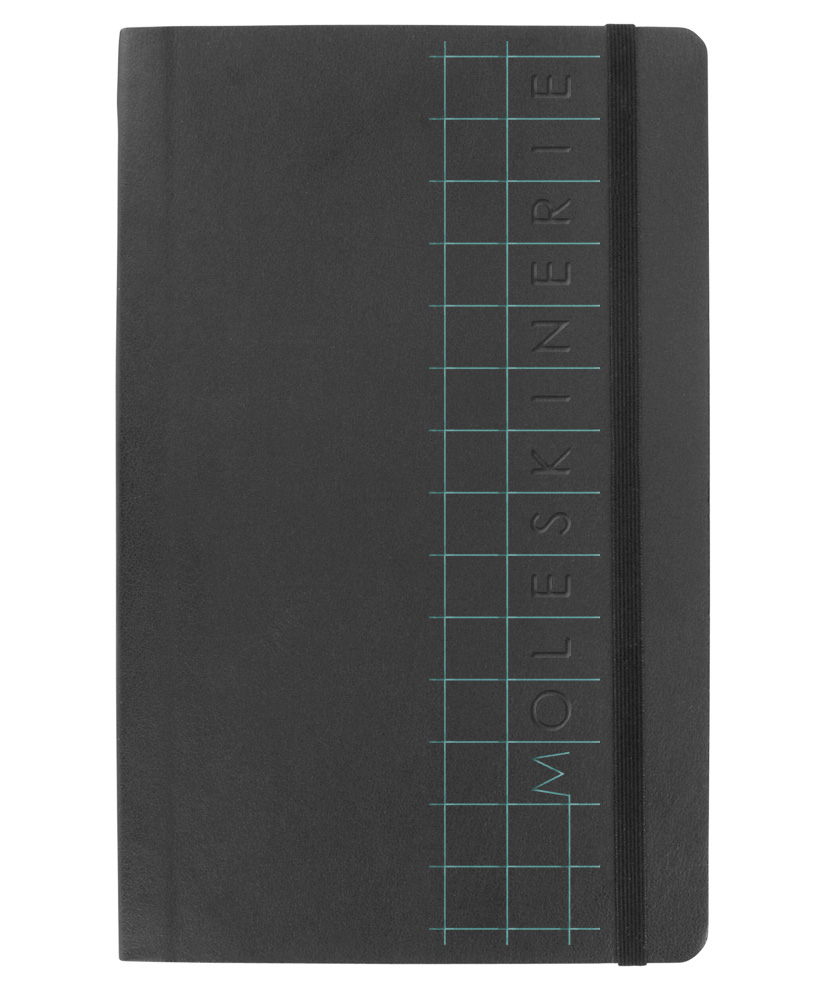
 application on typical moleskine notebook
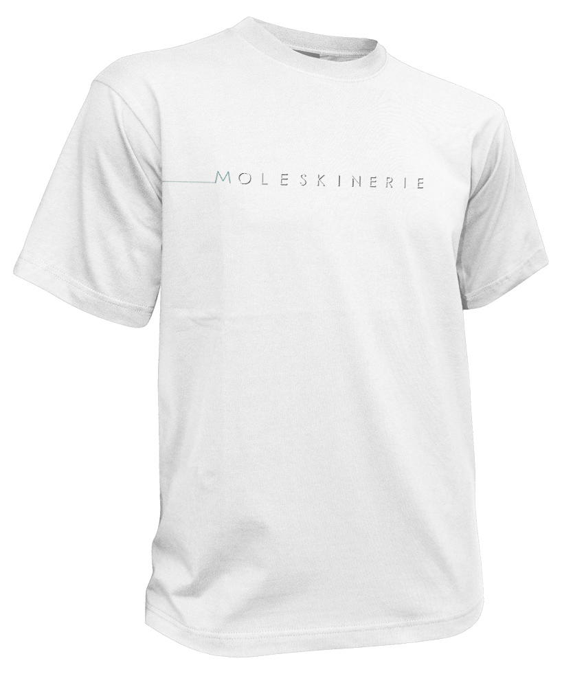
 application on t-shirt (logo can be easily altered to suit a different environment)
shortlisted entries (2162)