spread your creativity by sooyoung choi from korea
designer's own words:
The biggest contribution of Moleskine's objects is to help us complete creative tasks everywhere.
Now Moleskine has made its blog, Moleskinenerie, to further this idea and share with us.
My challenge in creating this logo was not only to convey the idea of two keywords; creativity and its
spread, but also trying to keep the brand's identity.
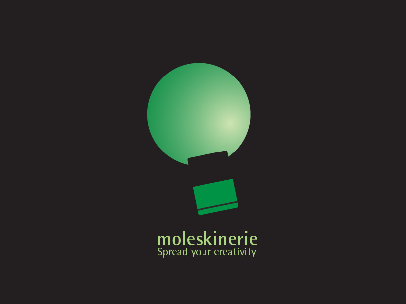
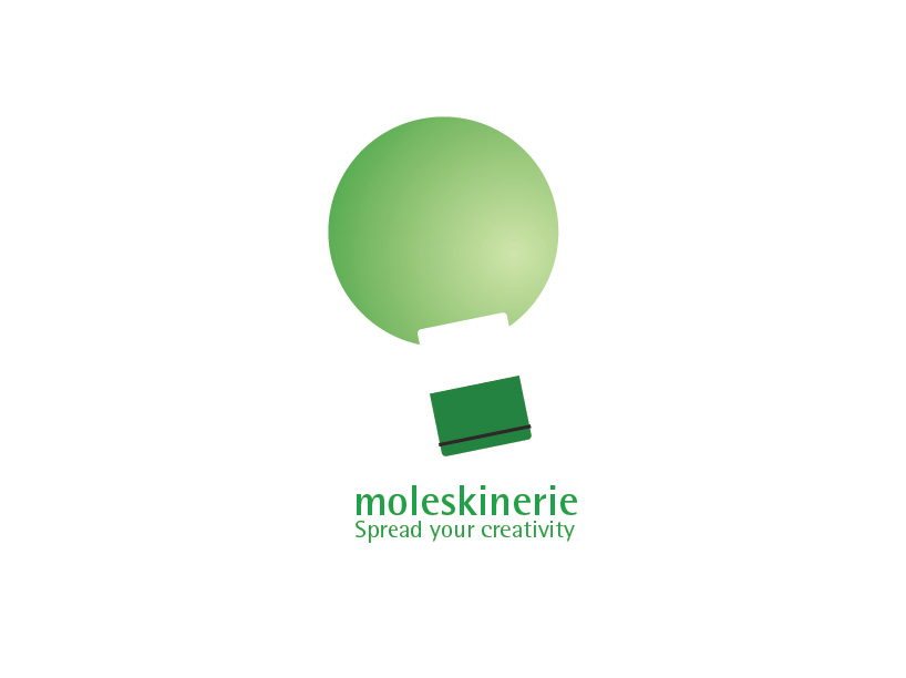
The logo consists of a circle and the symbol of moleskine's object.
The logo looks like both a bulb and a balloon. The diagonal composition gives the impression of flying.
The recess on the circle is created to intend a feeling of opening the notebook.


shortlisted entries (2162)