smileycow ;) by philip greene from uk
designer's own words:
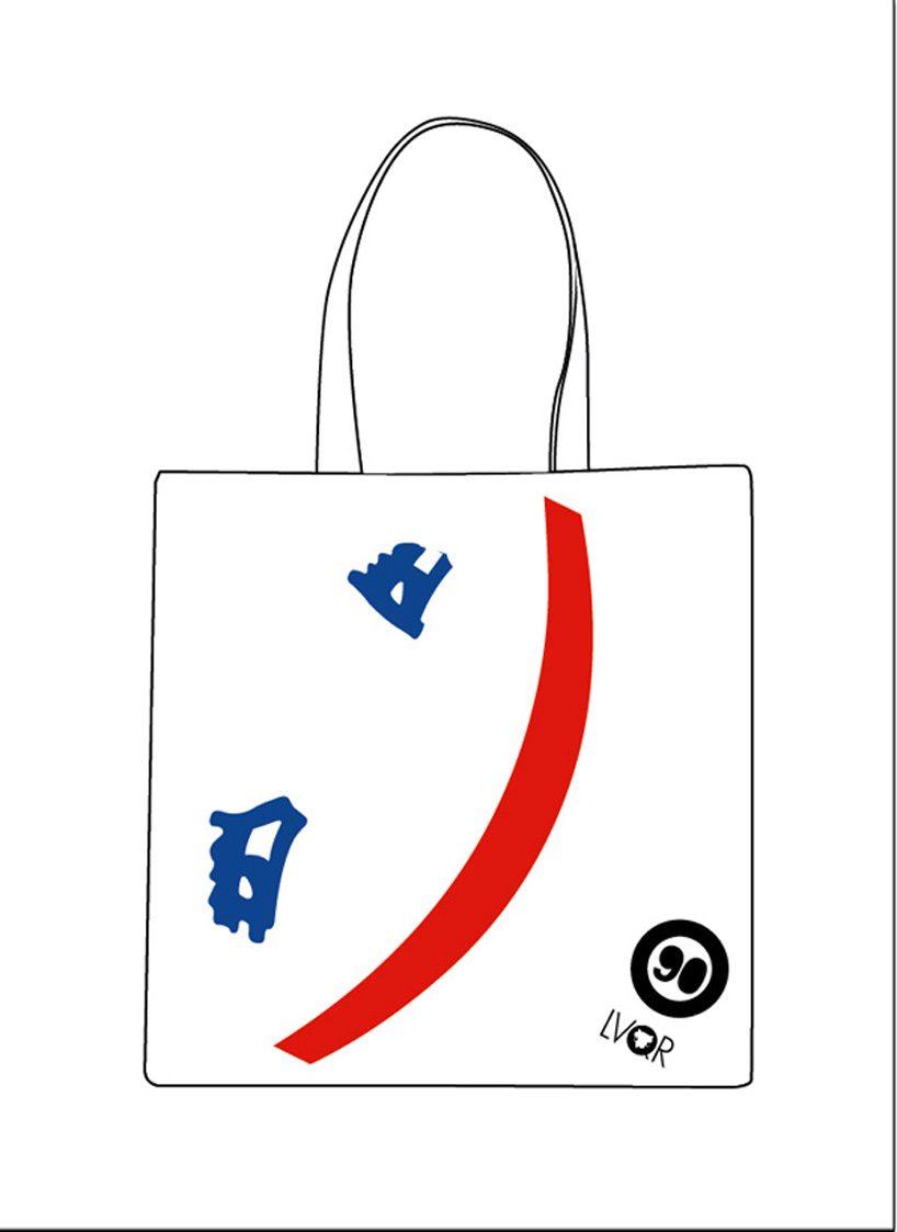
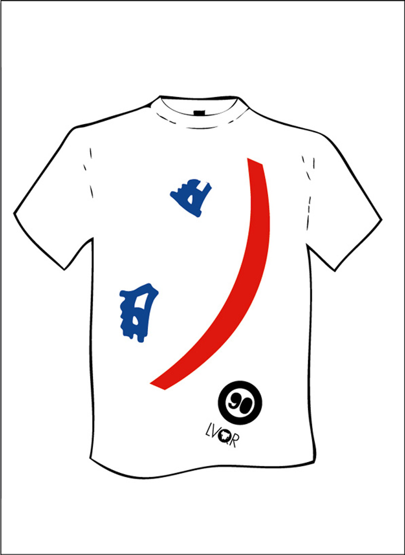
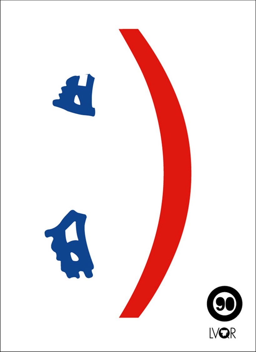
The t shirt design and bag design position the face on an angle to indicate the kinetic movement of the item, whilst the poster keeps faithful to the horizontal.
the poster design places the existing 90 logo in the position of a full stop, as though typed out on screen. using the two colours blue and red to highlight the mouth and eyes as well as the black logo.
canvas bag design
 t shirt design
 poster design
shortlisted entries (405)