sketchy by agnes bogar from hungary
designer's own words:
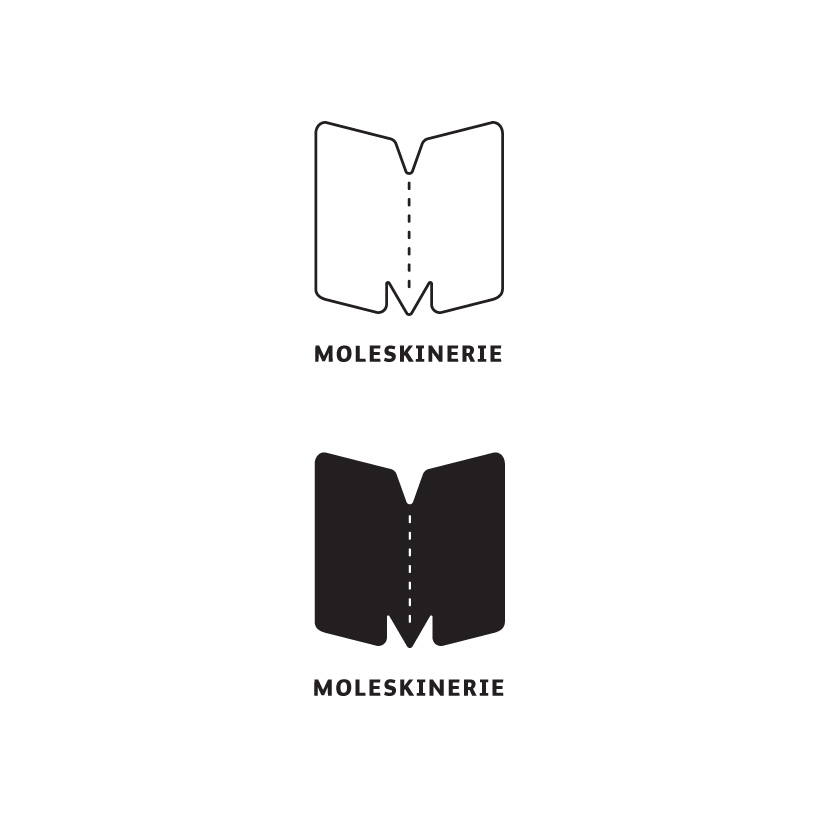
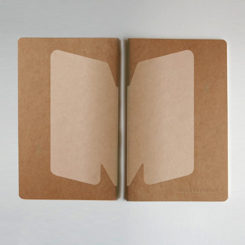
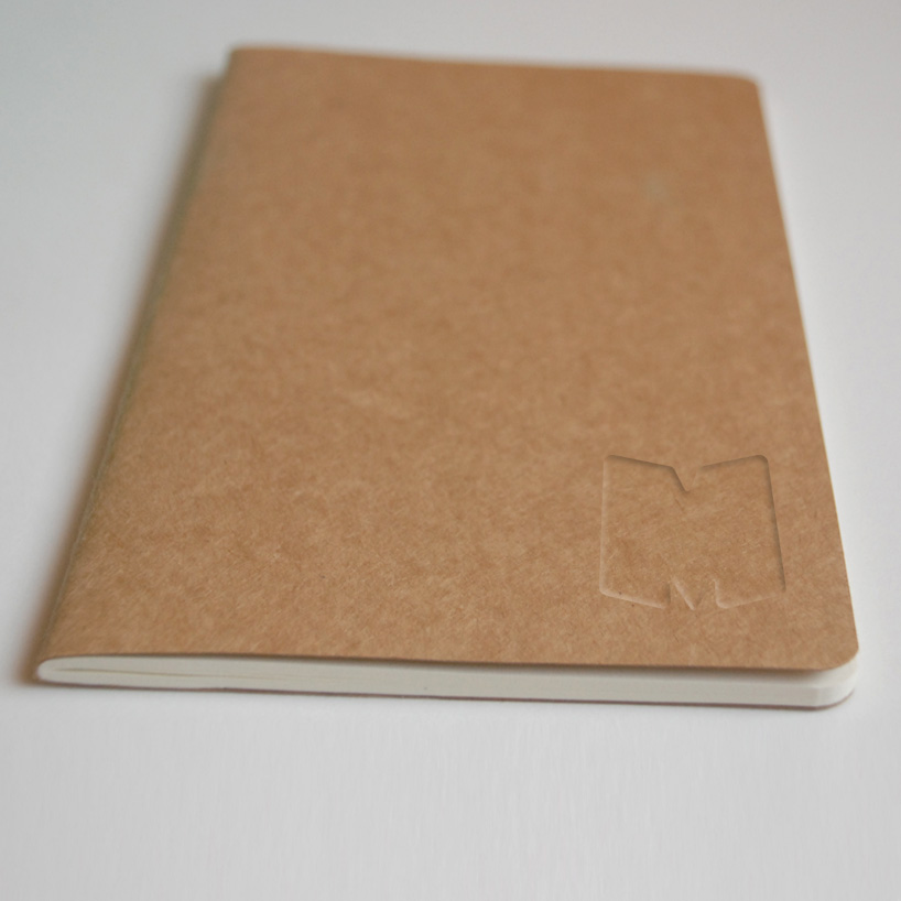
my logo was inspired by the shape of the moleskine notebooks. i used this shape to form the letter m which is the first letter of the brand name. while designing the logo, i tried to avoid completely new elements and preserve traditional features of the brand so that both ,old and new customers can recognise it as a brand that has been promoting creativity for several decades. at the second variation, i changed the style of the logo, so that it was getting more sketchy. for me that express the flavour of the Moleskine notebooks that your impressions first appears in it.
basic idea
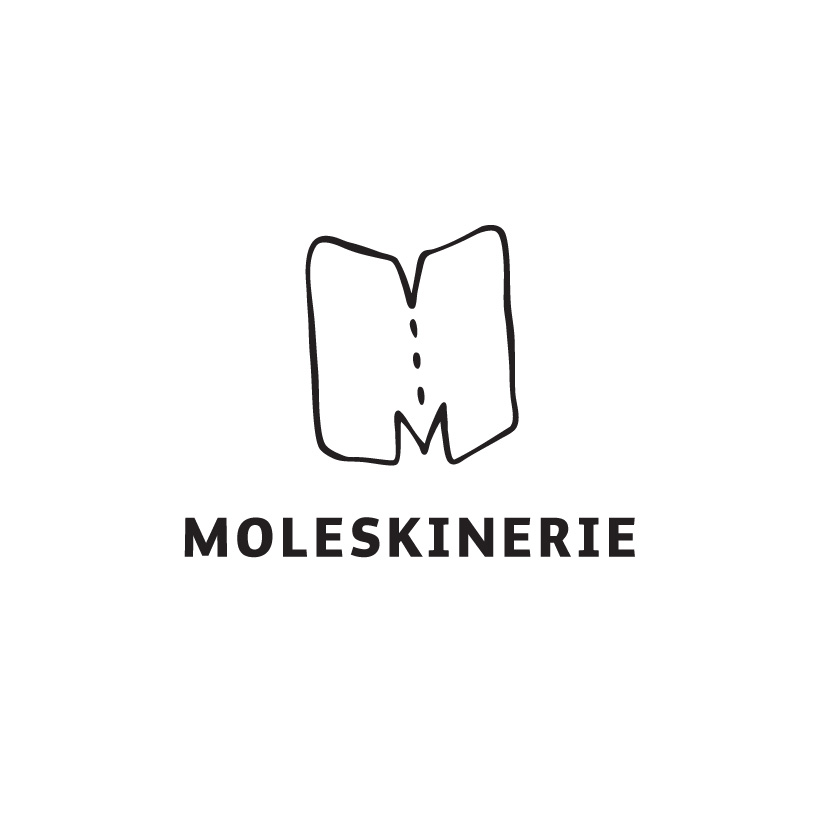 sketchy version
shortlisted entries (2162)