Simplicity is the key by filipa vieira from portugal
designer's own words:
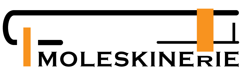
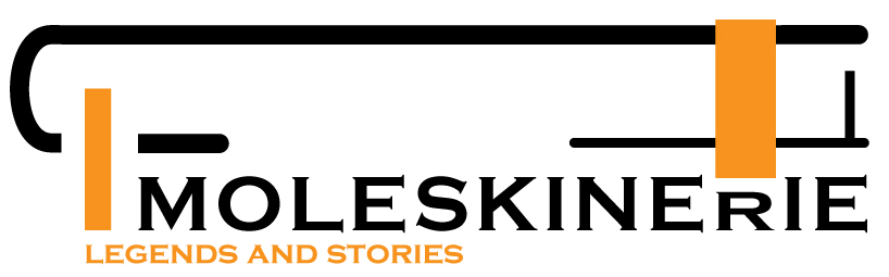
having as a reference point the history and concept of the Moleskine brand name, the logo intends to be a recognizable, but simplified, profile of a notebook.
the logo is composed of three straight lines, with round corners, using the iconic rubber band to hold the notebook and a marker.
since this is a logo to be used in a blog of such a well known company, it makes sense to keep the original lettering so an instant recognition should be possible. I decided to give a new dimension to the letter “R”, reinforcing it in that way.
the only color used may be changed, to underline the main subject of the blog in a particular moment, adding a new dynamic, giving to its visual a more aggressive and up to date graphic look.
shortlisted entries (2162)