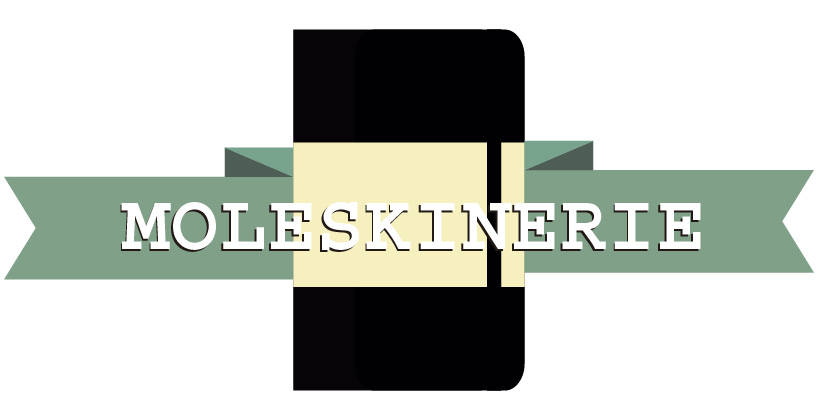
royal moleskinerie by yolanda aranda from spain
designer's own words:
The logo is intended to symbolize the greatness that has made Moleskine, being an indispensable point of reference for artists and creative minds.
a composition of three vector elements, two forms recognizable at a glance: a ribbon and a silhouette of a moleskine notebook. accompanied by a classic and simple typography, which focuses the attention of the logo.
vector outlines and filled with solid color so that you can scale the image without distortion.
its rectangular shape, is not subject to its application.
chromatic gamma is based on primary colors mixed to create tones that make the simple forms, easily recognizable by sight.
shortlisted entries (2162)