roundarrow by jose antonio galindo riaño from spain
designer's own words:
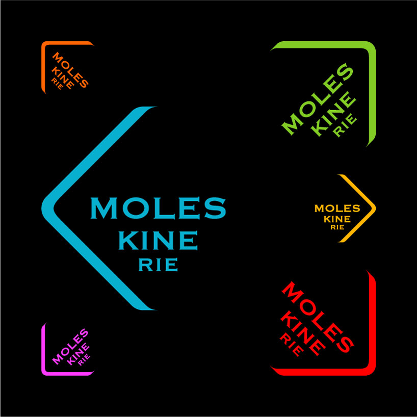
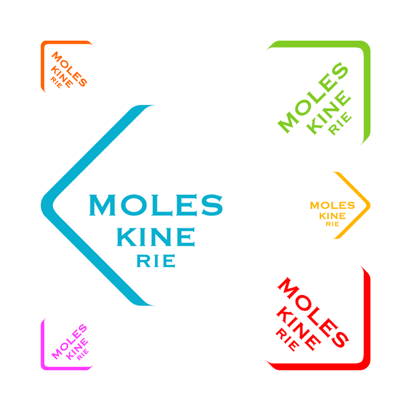
1. rounded corners are one of the most famous features of legendary Moleskines.
2. the new symbol suggests the shape of a notebook fore edge, creating a mark that can be perceived too as an arrow, meaning the aim of progress of the company.
3. the moleskinerie logo splits in three lines in order to focus the composition, keeping however the roots of the corporate identity.
4. the colour palette is the same brilliant one displayed in the mlskn belly bands.
5. the design simplicity allows multiple variations of the mark, depending of the arrow angle, making it very flexible.

![]()
shortlisted entries (519)