rip bon by fabian fischer from germany
designer's own words:
There are no big surprises here.
simple - reproducable - not too old - not too eccentric
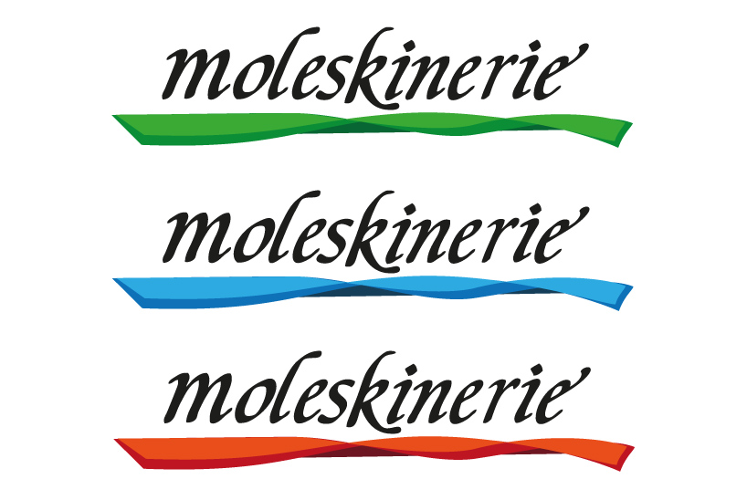
my logo uses a very basic calligraphy font, the "humanistic cursive". i designed the lettering with a brush on paper before i edited it digitally.
the part below the font represents a ribbon used by every moleskine notebook etc. (as far as i know)
a classic notebook or calendar cant be replaced by a smartphone app.
thats why it was important to me that the logo is handwritten.
color ribbon version
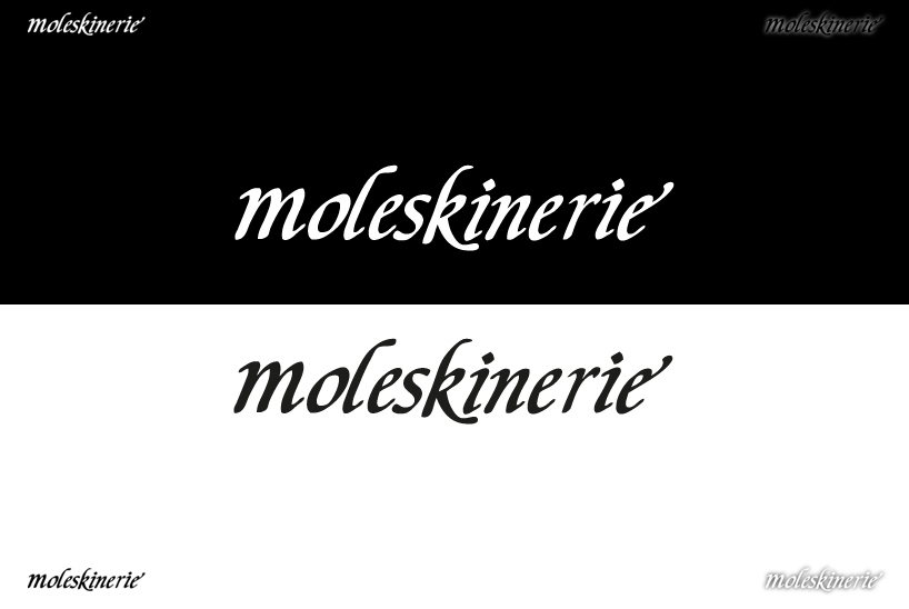 readability / recognition
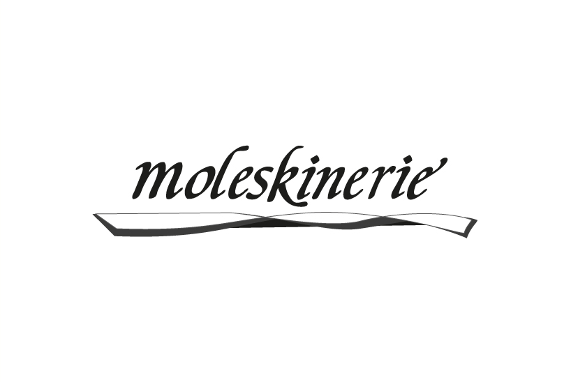 grayscale version
shortlisted entries (2162)