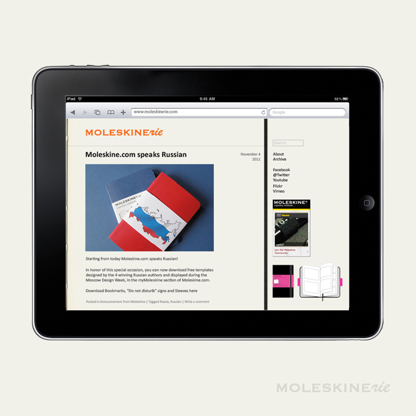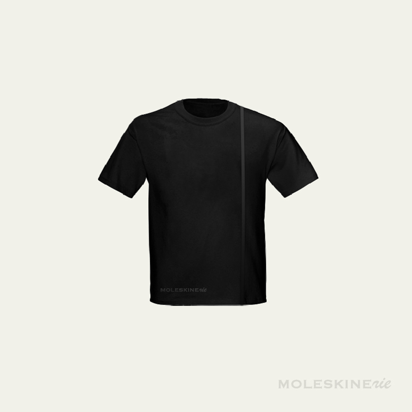
rie by jung-chen hung from taiwan
designer's own words:
As an iconic and legendary notebook brand for ages, moleskine logo itself is so strong that should be the core of all touch points. Therefore, moleskinerie as a official blog would be the digital extension of moleskine. Based on the rationale, the logo should have the core moleskine part, but still have its own personality.
Typing is the way we post, but writing is the way we create. Celebrate the handwriting as main part of moleskinerie logo which drives a strong metaphor. It encourages people to write, draw, and keep creating amazing stuff by hands. No matter digital or analog medium they use.


shortlisted entries (2162)