Renault 4 ReDesign. Johad Ellis by johad ellis from usa
designer's own words:
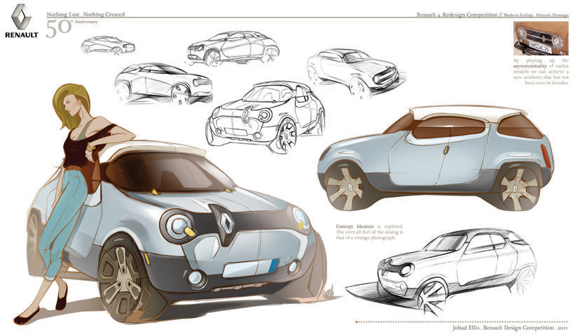
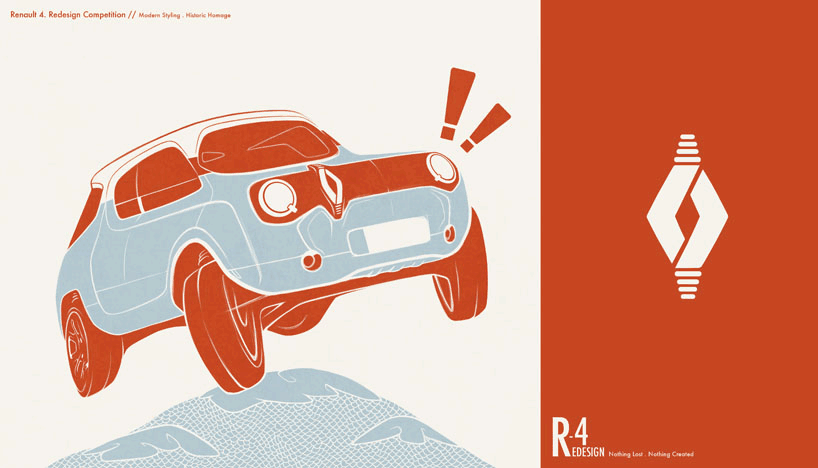
the original renault 4 has more character than most other vehicles. it's awkward, vertically inclined proportions give the vehicle an almost comical appeal. it was very receptive towards its surroundings, generally that of fashion, being french-based.
this modern interpretation of the vehicle aims to capture the same essence with major styling cues from the original design, but morphed into a modern, edgy look. the fashion appeal is still evident through colors, details, and material selection (i.e. the customizable side panel that spans through the doors). this vehicle, however, is more than just another styling venture. it encompasses the concept of circular economics and achieves its purpose through part reduction, materials and co-molding.
the vehicle is completely electric, with the charging socket located on the asymmetrical front logo, reminding the user of the car's brand identity. also, four bars located at the top and bottom of said logo, represent both the renault "4" name and act as a social statement to the public of environmentally responsible emission. the brighter the four bars are, the more you are doing for the environment.
last but not least, the interior exhibits minimalism and part reduction paramount to circular economics. there are no bolts and screws that hold this vehicle together. co-molding is the common denominator in keeping the vehicle stable. bio-plastics are injected into a tooling process that immediately bonds the two materials together, without having to bolt anything. a one-piece molded mft tub with a unique shape favors part reduction and allows for storage underneath the seats. the seats themselves are one-piece molded fab-foam soy based seats, which can be dissected and recycled.
the final design exemplifies the project brief and meets all the qualifications for a renault 4 re-design.
-johad ellis
design student. college for creative studies
Exploration 1
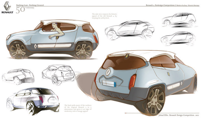 Exploration 2
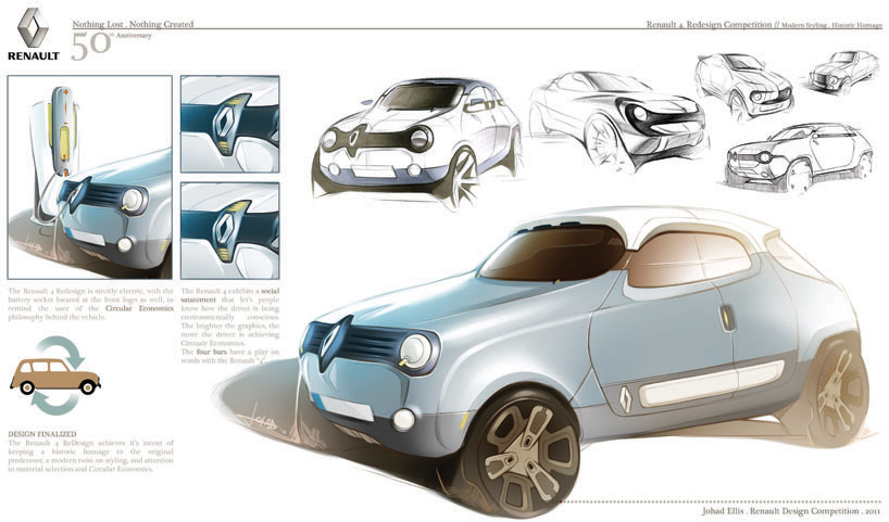 Final
Final
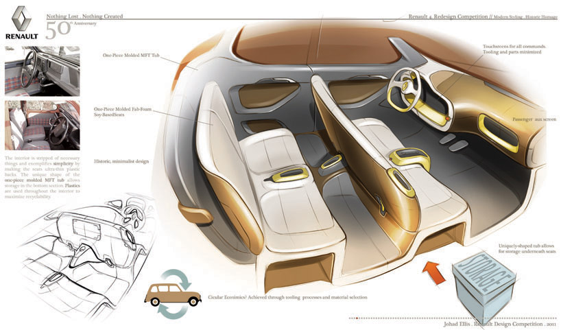 Interior
 AD
AD