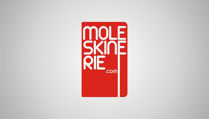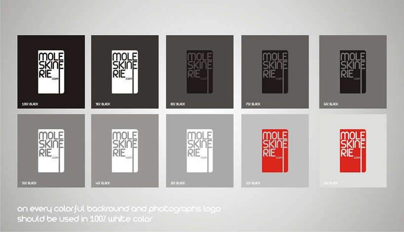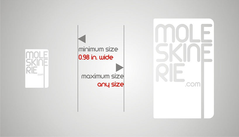
red icone by marek józefczuk from poland
designer's own words:
the look of this logo refers to moleskine notebook - well known shape with round corners. additionally I wanted to use a symbol for elastic page-holder, now therefore i gave letter "e" some long stripe running from the bottom of the letter up to the bottom of "cover".
font that i used in my work is very light and in my opinion - retro looking what refers to long traditions of company.


shortlisted entries (2162)