Rafael Fernández Sketched logotype. by Rafael Fernández from spain
designer's own words:
moleskine is a brand which make items as notebooks, pencils, pens, etc. people use to express themselves using their hands and tools. hand made, crafts and sketching are concepts linked to the company.
in their notebooks, people write stories, diaries, they sketch and eventually they make art.
moleskinerie is moleskine´s platform to share stories with their public who are able to interact with the brand and also share their thoughts and feelings..
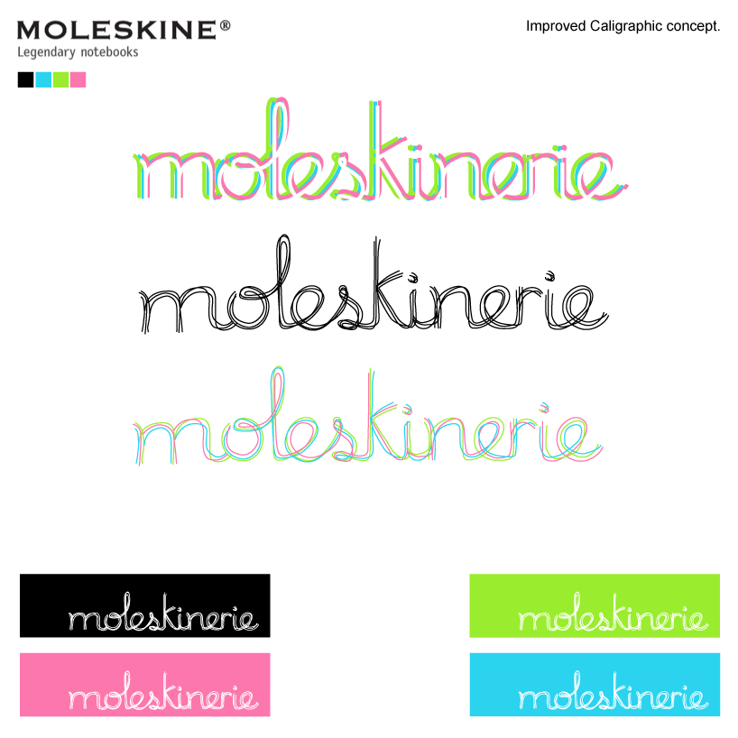
those reasons make me thought about "handmade" and "story-telling". i mixed those concepts in "calligraphy" which is the art of hand writting (using moleskine´s products of course!), and walking that way i created the first basic calligraphic concept.
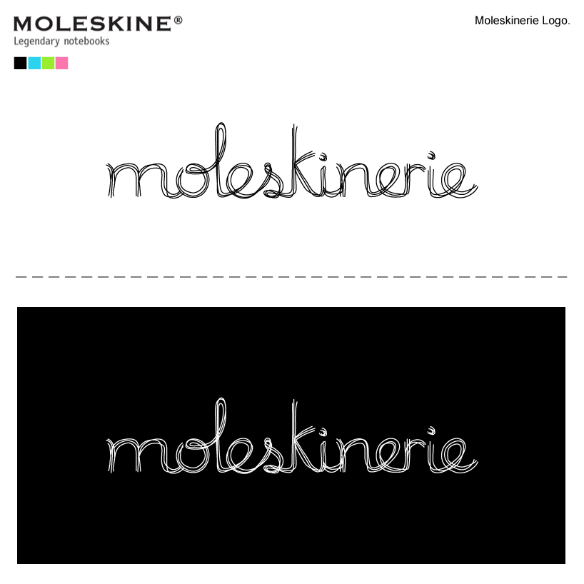
then i thougt about "sketching" and i developed a "sketched calligraphic logotype", representing pen strokes in a sketchbook brainstorming a moleskine logo.
that logo, express the idea of handmade, sketching and gives blog´s identity a direct link with moleskine products and public.
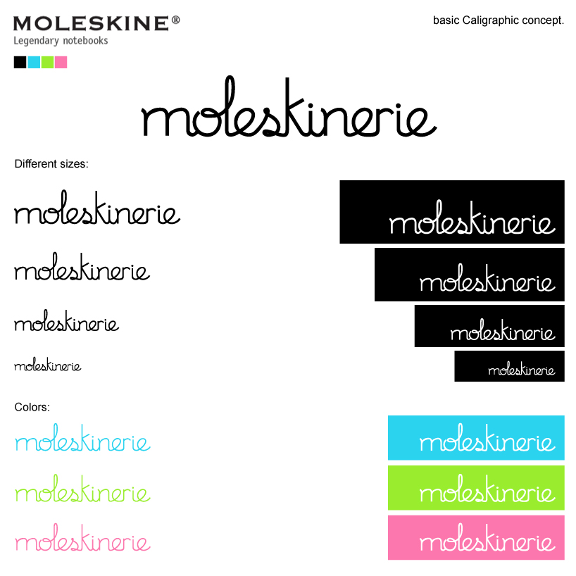
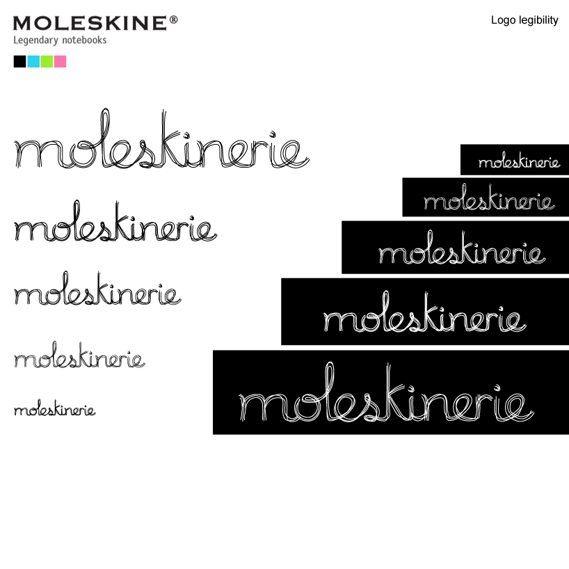
as shown in the pics attached, the final "improved calligraphyc logo" can be used in many different ways, colors, sizes and is readable in many different sizes.
moleskinerie logotype proposal.
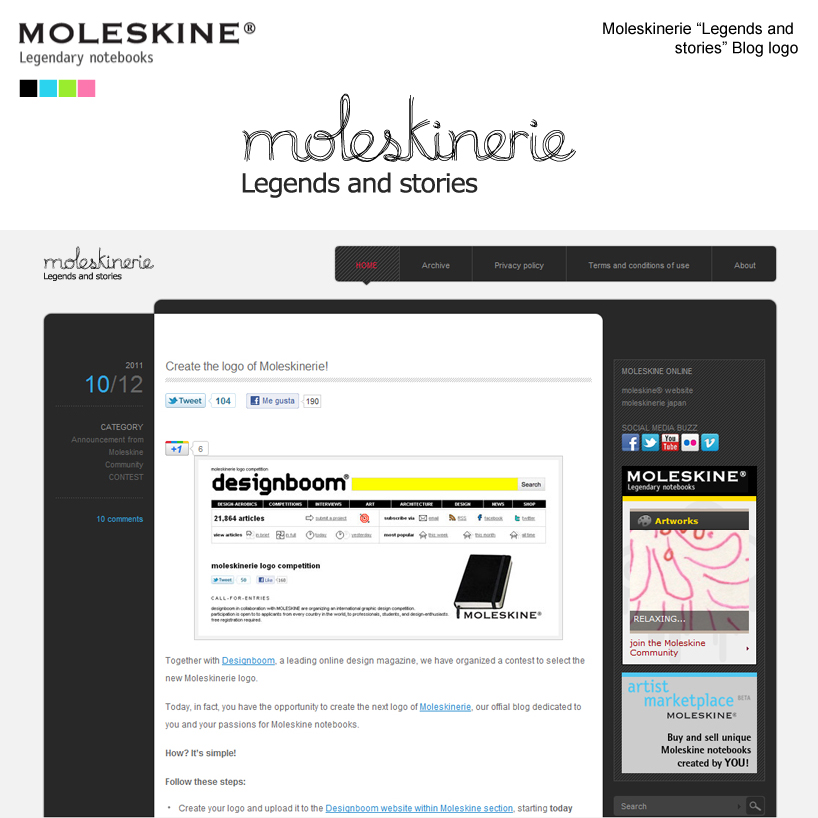 moleskinerie legends and stories blog logotype application.
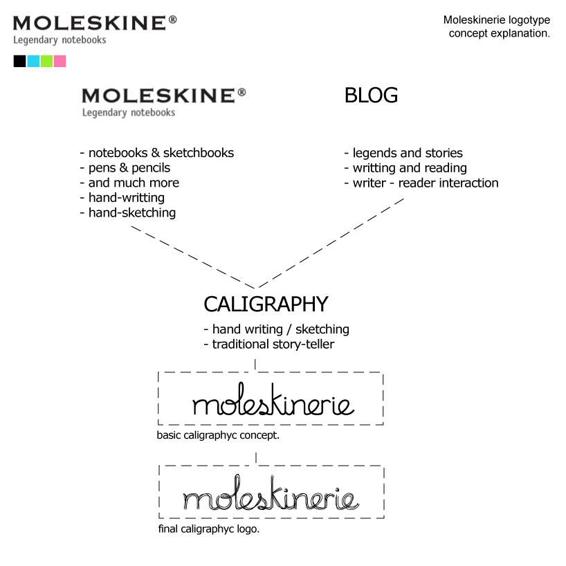 concept explanation.
 basic calligraphyc concept.
 improved calligraphyc concept.
 logotype readability