rad10 by dong suh from usa
designer's own words:
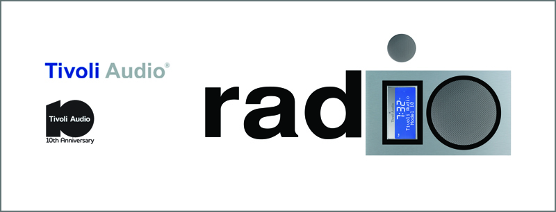
The Tivoli Audio 'rad10' competition entry focuses on the following:
1/ an interplay between the number ten - '10' and the word / text - 'radio' as a mixed graphic design motif.
2/ a simplicity towards the Tivoli Audio 10th anniversary model design and highlighting major elements of its digital display and speaker outlines as the prominent components.
3/ a creation for more advertisting / marketing opportunities by substituting other words / text schemes such as 'aud10', 'revolut10n', 'redefinit10n', etc.
4/ by tradition, the tenth anniversary is marked by the material aluminum (or tin). the subtle color of the 10th anniversary model design and 'Tivoli' logo in the billboard design provides a good balance to the overall white space of the canvas.
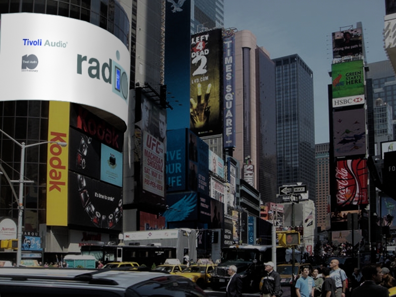
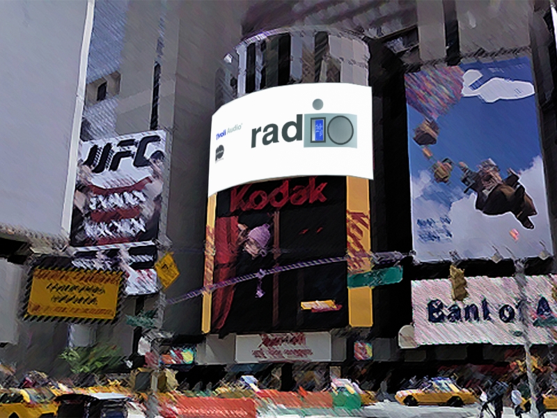
A simple, pure statement of the 'rad10' competition entry design for the billboard display provides more direct attention, proper emphasis, and general contrast from adjacent surrounding billboards and from an overflux of graphics, motifs, and visual stimulants found in Times Square.
Thus the objective of the 'rad10' competition entry was to keep it simple, keep it to-the-point-pure, and keep Tivoli Audio 'rad' with '10', 'rad10', the 10th anniversary edition.
ta_design_dws
 ta_bb_view_01_dws
 ta_bb_view_02_dws