Portals by gustavo de casimiro-silveirinha from portugal
designer's own words:
as a first approach we sought to understand how moleskinerie.com should be identified and identifiable, recognized and recognizable and how we could potentiate its full power as an icon and how to make it stand out in the crowd.
this proposal aims to define moleskinerie.com as a blog with myriad of faces, a myriad of users and uses, hence the repetition. it also searches for that sharing feeling that open books have, so this logo uses an open/new page metaphor by dividing the legs of the typography, in a way that between each semi logo it seems there is an open moleskine. the portals represented also allow you into moleskinerie.com and are present in the logo, giving grandeur to the brand.
keeping a base in the world moleskinerie.com we tried to make a contemporary logo that could work in any format or place.
we wanted the viewer to keep in mind once he has seen the logo, the connection with moleskine and the curiosity to search what moleskinerie.com is. for the blog’s old followers/ reader, we wanted to keep a real sense of belonging.
the logo represents not only the present of moleskinerie.com but also the future! it represents the award for the information it contains and shares as well as the award for each and every member of a tight community already created of creative and talented people, which can include everyone!
you come to moleskinerie and you show lyrics for a song in a moleskine, but you can also show quantum physics or nuclear research or even the plans for a rocket design to get to mars. once you imagine it, everything can become real!
an open moleskine is an opportunity. an open blog is an opportunity too. moleskinerie is an opportunity! together they create all kinds of possibilities. the richness of the act of drawing is recalled since ancient times, therefore to reflect history in a contemporary sense a design must serve as an input in the simplest of ways of what one means. this input pushes the boundary when a simple logo represents all the information in moleskinerie.com and yet it identifies it as unique.
when you open a moleskine you can create all kinds of perspectives, all kinds of worlds, all kinds of writings. when you open the moleskinerie.com blog you don’t know what to expect. that’s unique in the vast choice of the internet.
the way this logo works in different formats and colors allows moleskinerie.com to change color or placing not losing its own identity, and always keeping in mind the marketing of such important piece of one’s survival kit which is a moleskine and the information shared in moleskinerie.com.
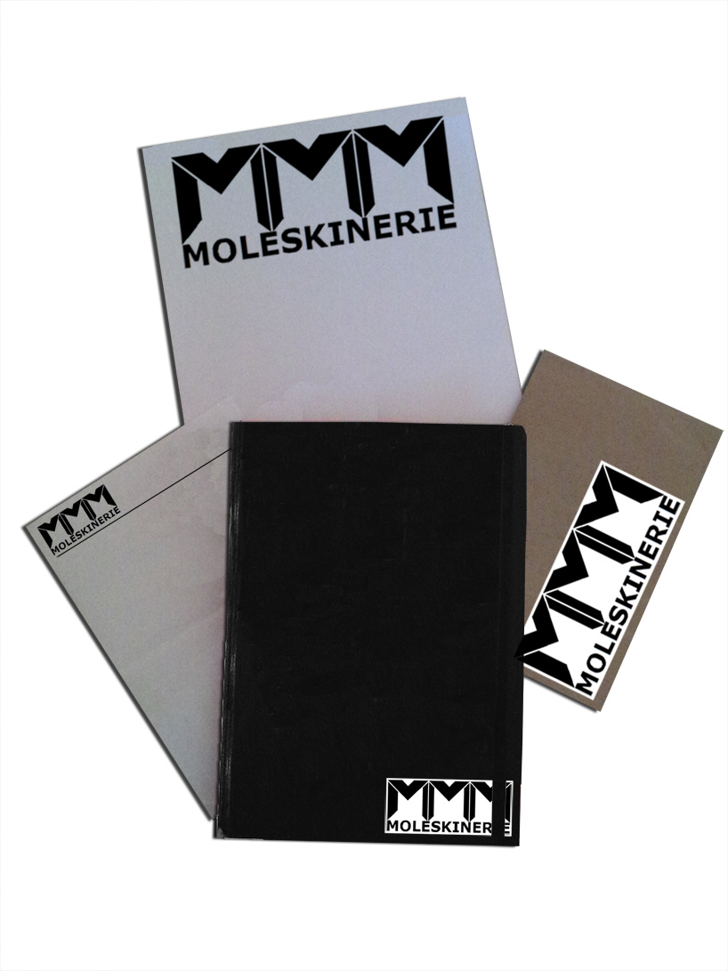
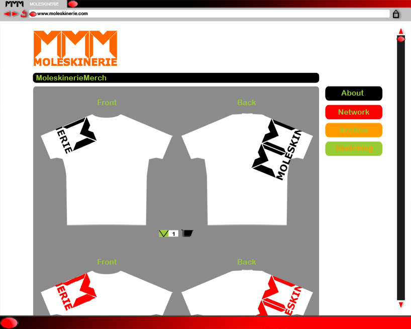
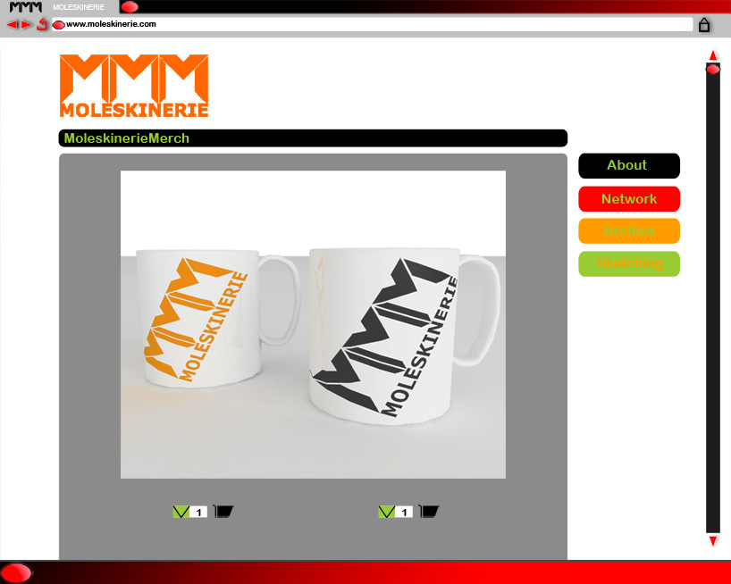
as shown in the pictures a vast range of products could be made with the logo, making it focused in various target audiences of readers of moleskinerie and new ones. once you have made a good logo you can make stickers that keep passing the word, or fabric patches that endure the message. people will ask what is it?, where is it? a trend will be born, as a legend like moleskine has, bringing hugeness to moleskinerie.com.
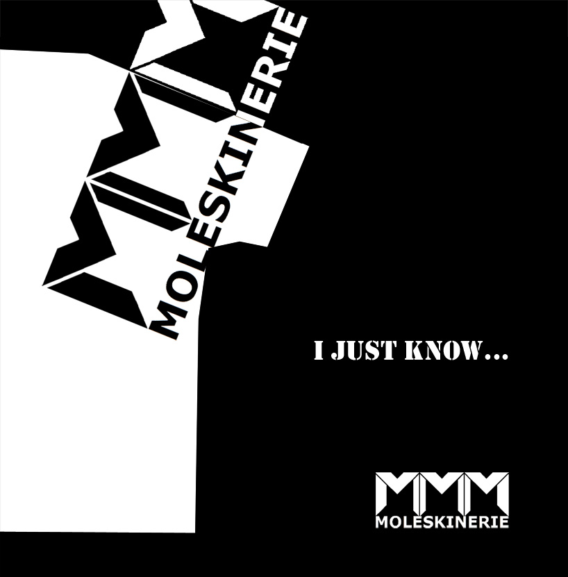
Poster-Proposal
 Stickers and Patches
 Website and Merchandising
 Website and Merchandising