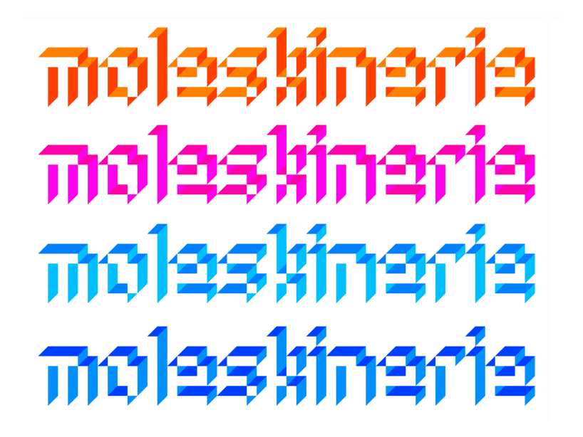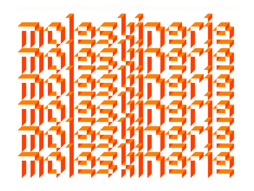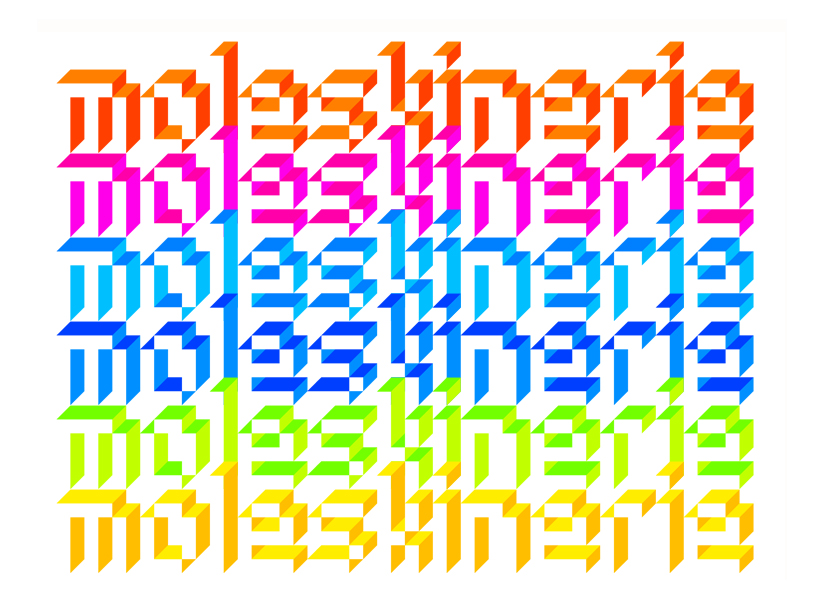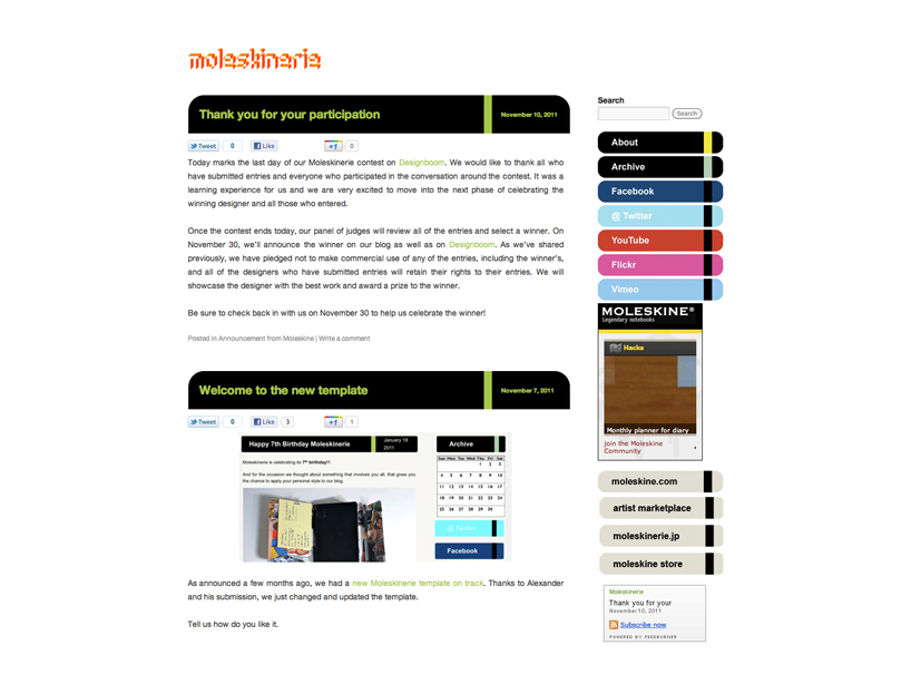
pixelated 3D moleskinerie logo by juan enrique barros from chile
designer's own words:
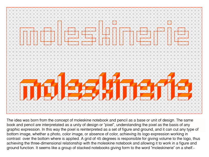
The idea was born from the concept of moleskine notebook and pencil as a base or unit of design. The same book and pencil are interpretated as a unity of design or "pixel", understanding the pixel as the basis of any graphic expression. In this way the pixel is reinterpretated as a set of figure and ground, and it can cut any type of bottom image, whether a photo, color image, or absence of color, achieving its logo expression working in contrast over the bottom where is applied. A grid of 45 degrees is responsible for giving volume to the logo, thus achieving the three-dimensional relationship with the moleskine notebook and allowing it to work in a figure and ground function. It seems like a group of stacked notebooks giving form to the word "moleskinerie" on shelf.-
