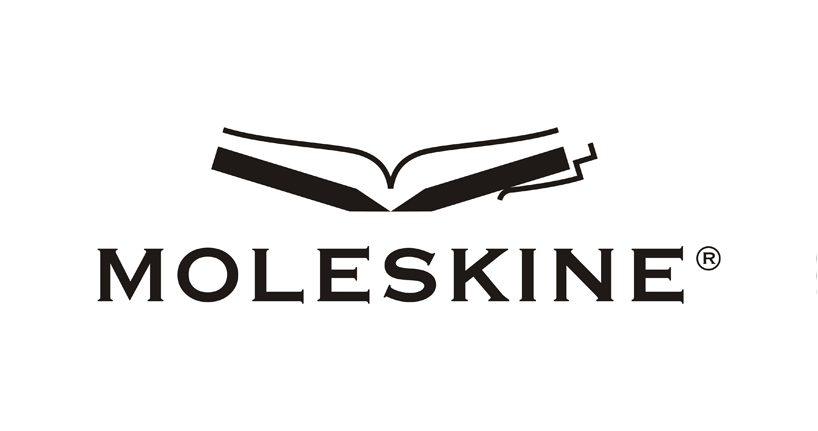
pen + pencil + notebook = moleskine logo by velislav velikov from bulgaria
designer's own words:
i used corel draw13. the logo can be open in adobe illustrator, adobe indesign and import in adobe photoshop with transparante background.to create the perfect logo studying the field of activity of moleskin. looked at the website in detail. I tried to combine the best elements such as pencil, pen and notebook. These are the three pillars of office supplies. are themselves connected. they can not live without each other. a few sketches come to perfect vision. open covers of a notebook are silhouettes of pen and pencil. thus the three elements are intertwined in elegant and stylish image. logo shows clearly and precisely the activity of moleskine.
black & white
 black & gray
 white & black
 this is the place
shortlisted entries (2162)