pc by leonardo bua from italy
designer's own words:
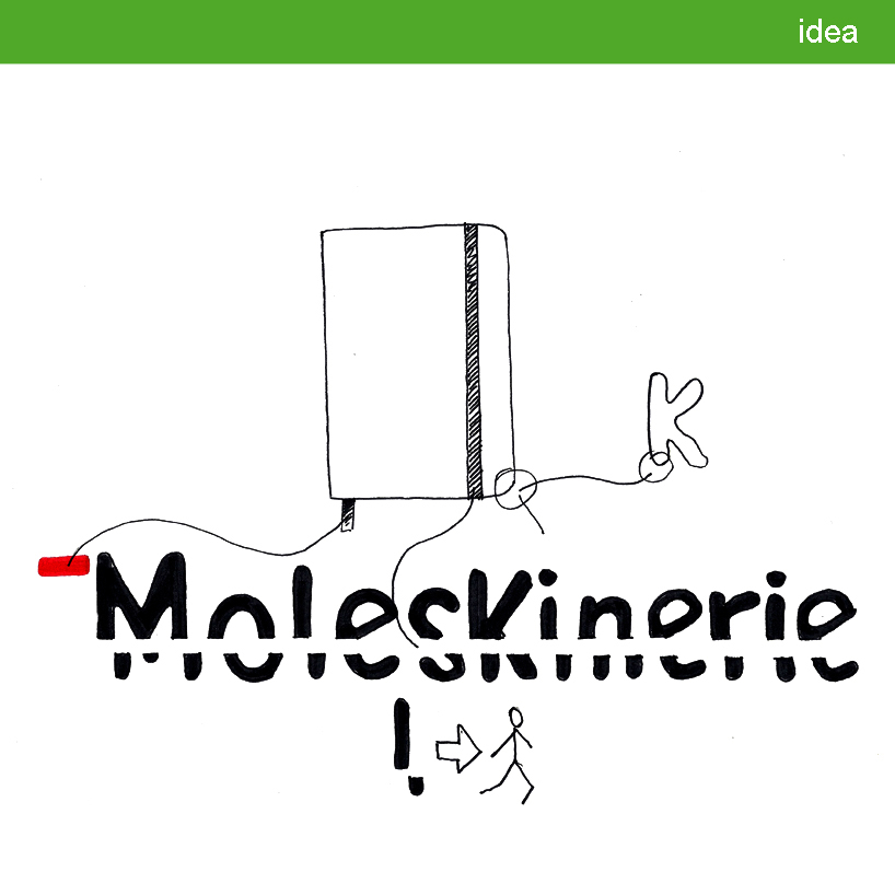
the distinctive elements of this project physically and symbolically represent the world of moleskine: a trusted daily travel companion and a functional, practical means for expressing thoughts and ideas. It strives to transmit identity to a community of people that love to communicate and relate to one and other.
this logo reflects these themes visually in various ways. the font color black was chosen as it is the base color of the brand. lowercase letters transmit an easy, colloquial style. the softened angles of the moleskine notebooks and other items in the range are represented through the creation of a font with rounded edges. a strong flag sign accents the M and connects one to the product’s bookmark. the elastic closure is represented by a bar which runs across moleskinerie, separating the top and bottom parts of the word. the slight offset of the lower part of the letters was inspired both by the flow of the written word as well as by the brand’s mobile, nomadic identity.
idea
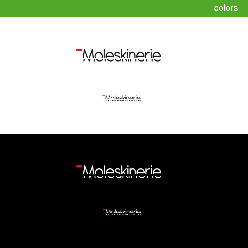 colors
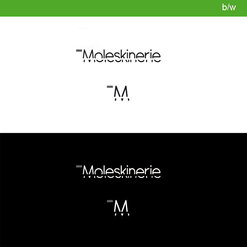 black
black
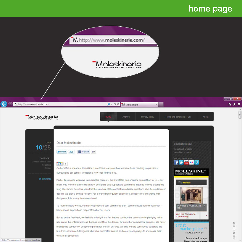 homepage
 gadgets