pages from my moleskin by carrie chan from usa
designer's own words:
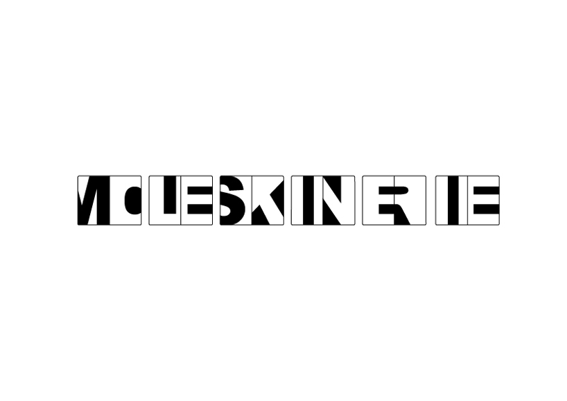
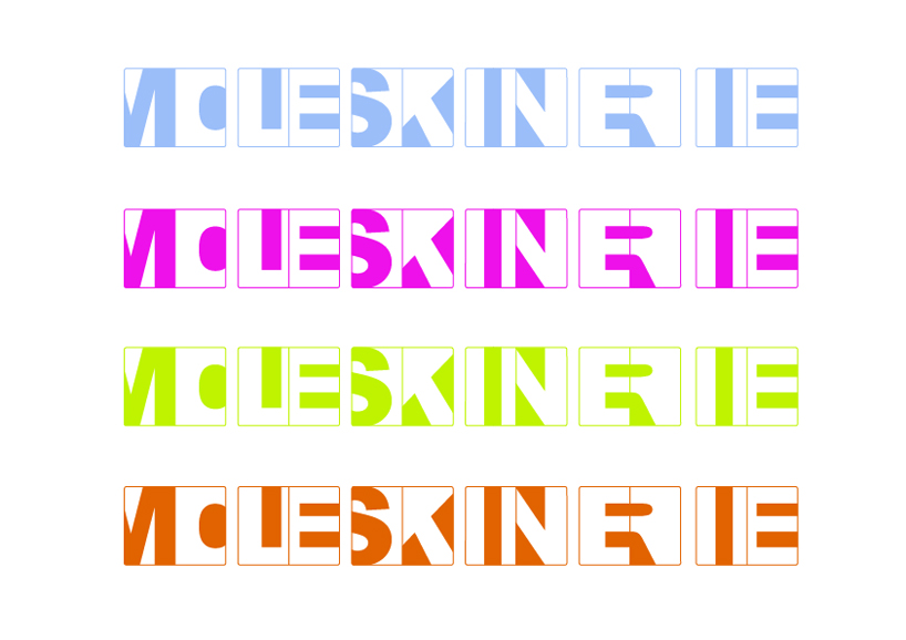
One of the most recognizable features of the Moleskin notebook is its rounded corners. My concept for the new "moleskinerie" logo is to emphasize this feature and to incorporate it into a new typeface. The new logo uses the proportions of an opened Moleskin notebook as a blank canvas for the text, where each letter fills one page. The new "moleskinerie" logo is a play between the positive and the negative space in typeface that help us comprehend and convey the words we see and write.
Moleskinerie logo black and white
 Moleskinerie logo color
shortlisted entries (2162)