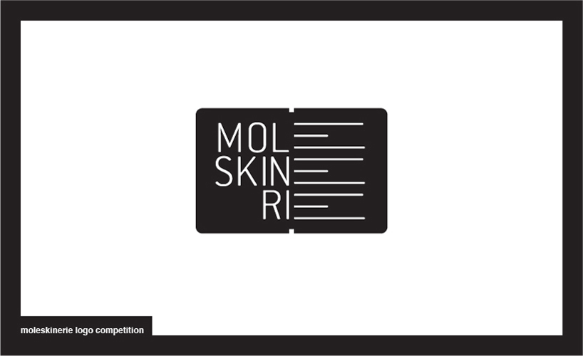
over the top by Dario Volpe from italy
designer's own words:
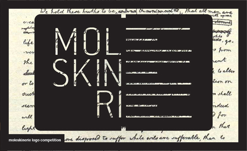
the shape of the logo clearly identifies an open moleskine, to symbolize the blog as a repository of ideas open to moleskine’s users. inside there’s the moleskine text in an overlay composition that expresses the concept of uploading your moleskine to the blog. the letters “e”, with their shape, create the lines of a blank page, to express the concept that moleskinerie is a space where users can post content, ideas, etc…
mark
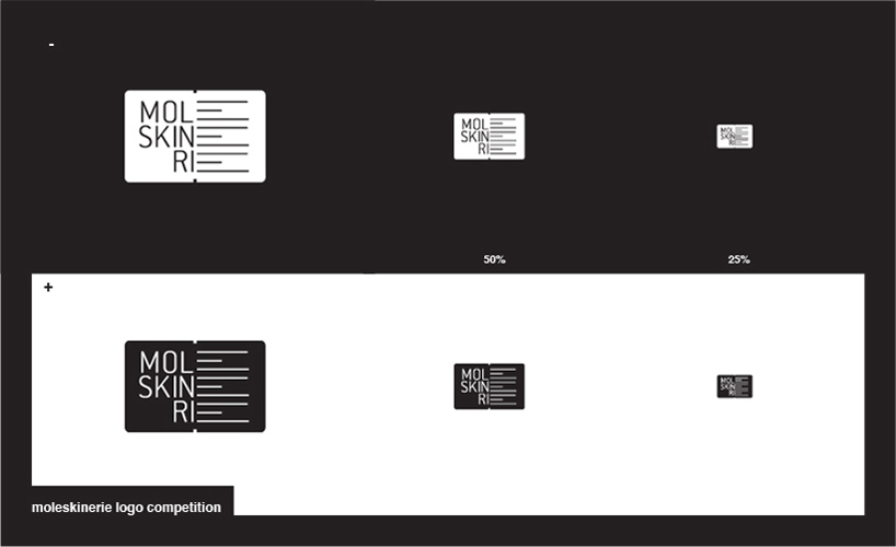 reduction
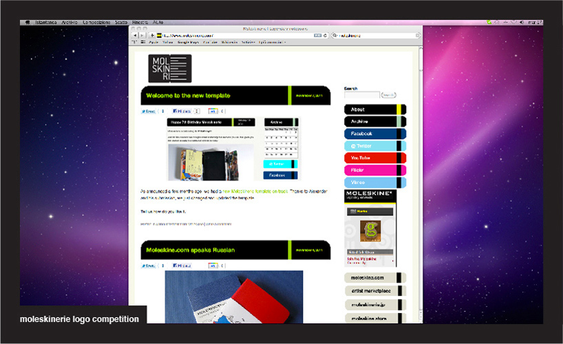 application to the blog
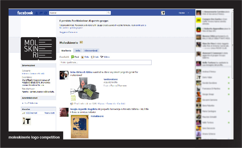 application to facebook
 application to mobile, logo imprinted
 application
shortlisted entries (2162)