opened ! by anri turtulli from albania
designer's own words:
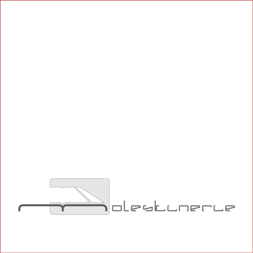
my logo proposal aims to be simple and meaningful at the same time. i got inspired while reading about the moleskine's free spirit. so the basic idea of the logo is the moleskine silhouette itself presented in a free boundaries form to highlight the brand and it's opened character to art and originality all over the world. also moleskine is a form of communication and that's why the main target was avoiding sharpness by using the brand's round corners. developing this concept, exclusively for this competition, i created the typography used in the logo. another moleskine detail i absolutely had to borrow was the identifying elastic band. the silhouette of the diary generates the big m. the logo is a vector design realized in adobe ilustrator cs5.
1 . moleskinerie offical logo
 2 . single colour , graphic symbol
 3 . experimenting
 4 . experimenting again