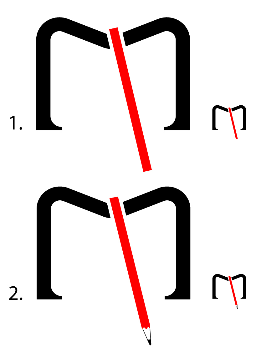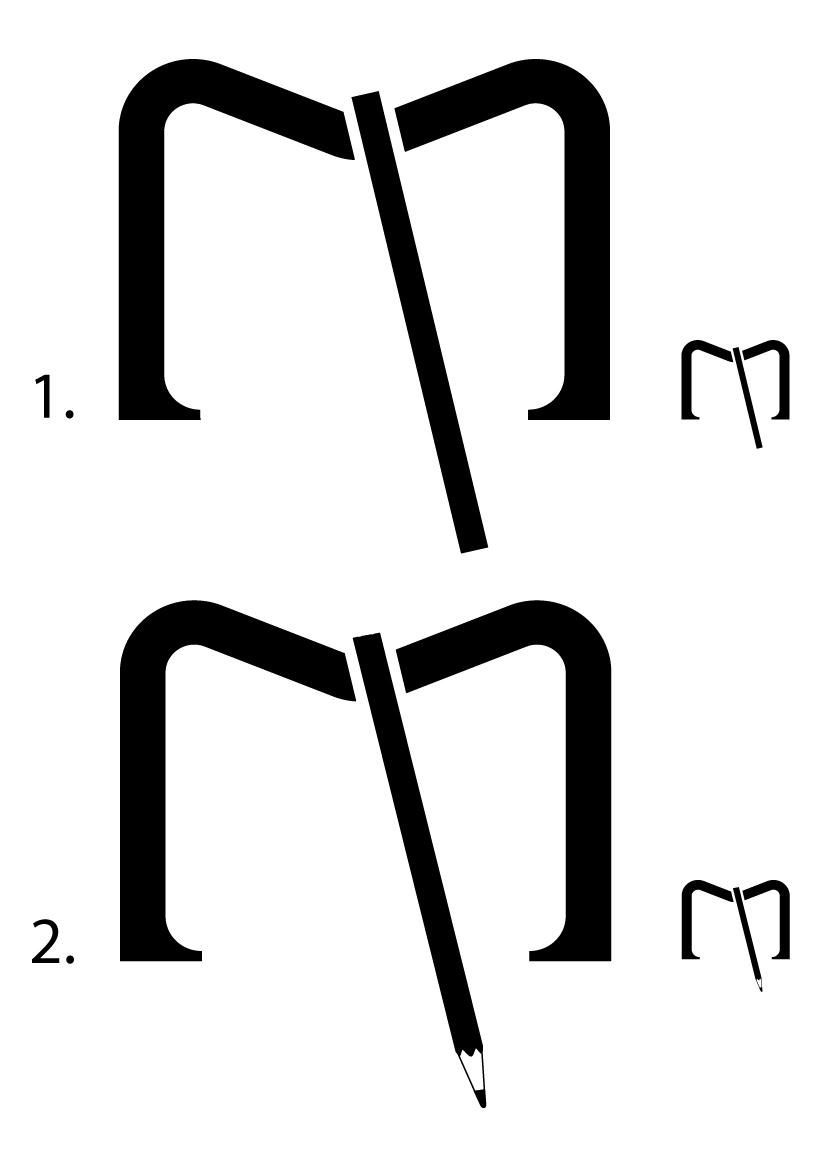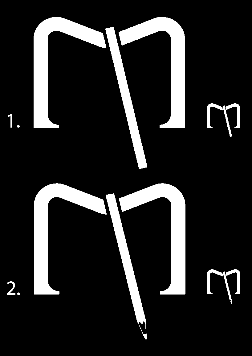
open book by veronika antoniazzi from italy
designer's own words:
the proposed logo reflect the typical characters of the famous notebook: the rounded edges, the clean and minimalist design, the rectangular sign of the elastic.
all this mixed in a form that recalls the "m" of moleskine but also the image of a ready to use open book, a book where to write thoughts and ideas.
the nomadic and dynamic character is represented by the diagonal line, the last one in second version is replaced by a pencil.
the chosen colours are black and red: black is the classic colour of the brand and red is the colour of passion and movement.
obvious is the reference to the font used to write moleskine.
logo-colours
 logo-positive
 logo-negative
shortlisted entries (2162)